Women Safety Service: Service design case study | Tangram Studios
Our work Services Blog About Contact us
Public safety · Government sector

Women Safety Service

Punjab built a women's emergency service, then almost no one used it. Two years after launch it had reached 0.3% of the women in the province. We evaluated the whole service and redesigned it as an ecosystem rather than an app, rebuilding awareness, trust and access across digital, physical and organisational touchpoints.

Role
Service design
UX research & strategy
Scope
UI/UX design
Creative direction
Category
Public sector
Emergency services
Client
Punjab Safe Cities
Authority
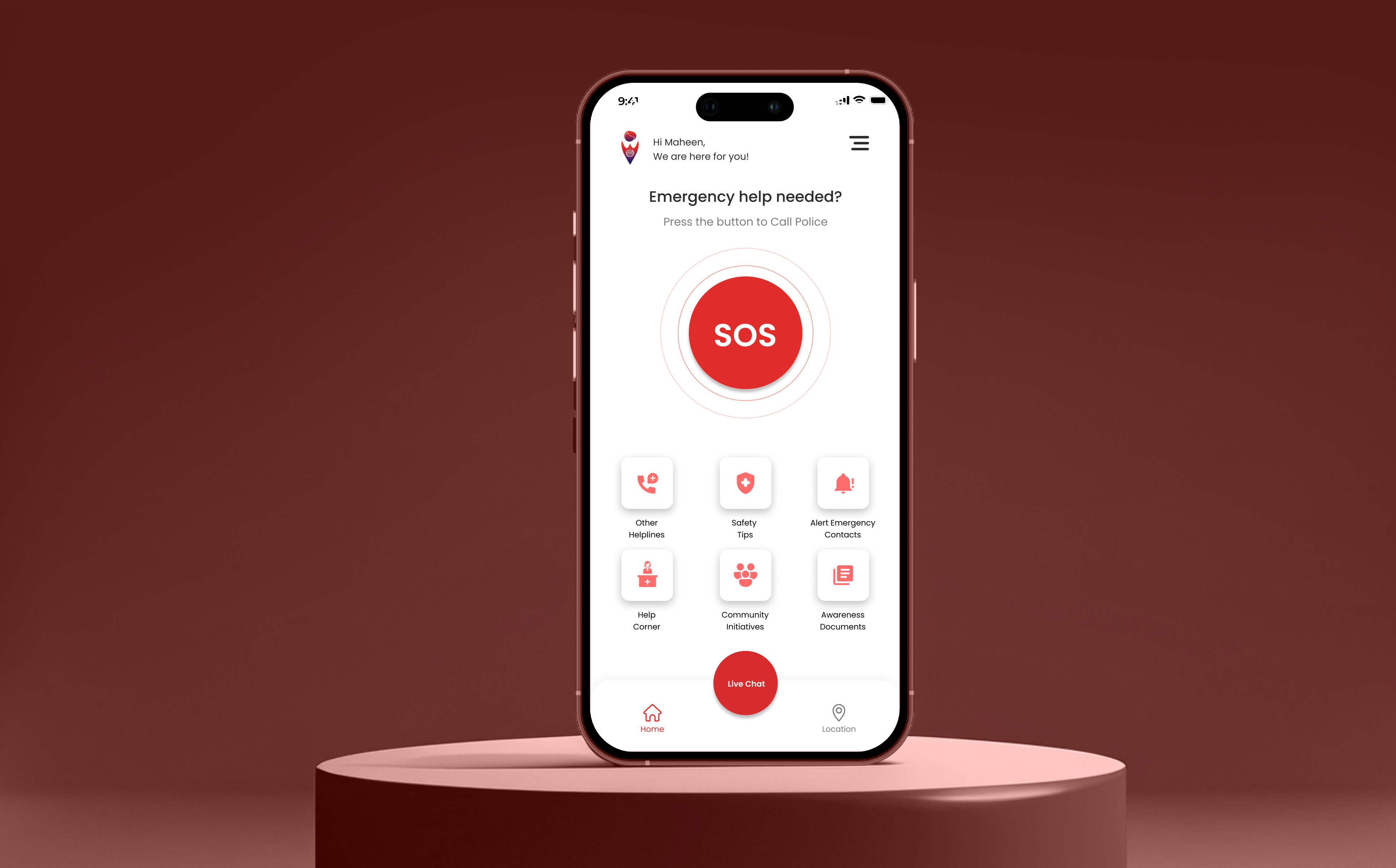
The app home screen on a phone standing on a deep red podium
01 · The problem

A safety service is worth nothing until a woman believes it will answer.
90%
of helpline calls were hoax or accidental
93%
would use a safety service in a violent situation
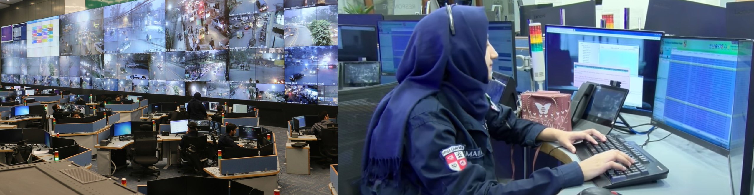
Inside the PSCA command centre, a wall of live city camera feeds and a female operator working the safety helpline
The infrastructure was already there, a command centre, live city feeds, trained operators. What was missing was not technology. It was a service a woman could find, understand and trust.
02 · What we learned

Not a broken app. A service women could neither see nor trust.

01
Most women had never heard of it
Outreach relied on seminars, leaflets and banners, so it reached very few people.
02
The app was hard to use in an emergency
It dialled instantly, shared location only during the call, and gave no way to practise beforehand.
03
The service was not seen as reliable
Women feared retribution, local stations varied in quality, and reporting to male officers felt uncomfortable.
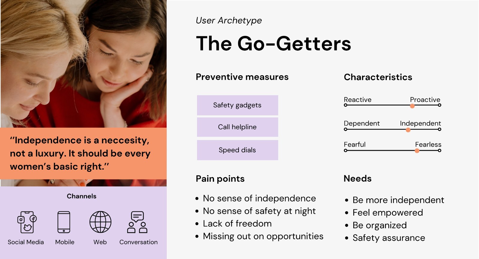
Two archetypes, one service

Half the women wanted to act but did not know how. The rest already carried gadgets and speed dials. The service had to hold both.
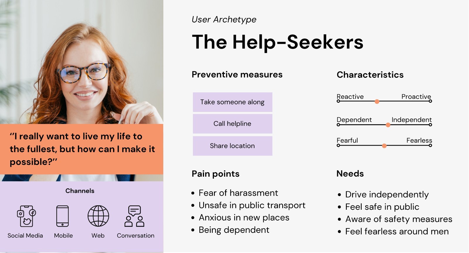
User archetype, The Help-Seekers, preventive measures, pain points, needs and channels
User archetype, The Go-Getters, preventive measures, pain points, needs and channels
03 · Design principles

Three rules carried every decision that followed.

The research pointed at trust and visibility rather than features, so the principles had to hold across the app, the street and the organisation, not only the interface.

01
Be visible before you are needed
A safety service found during an emergency is already too late. Awareness became a design surface, not a marketing afterthought.
02
Earn trust through people, not screens
Verification, female responders and community refuges do what no interface could, they make the service feel safe to use.
03
Prepare, do not only respond
Demo mode, safer routes and reviews move the service upstream, from reacting to an emergency to preventing one.
04 · A multichannel safety service

Four pillars, shifting from reactive response to prevention.

The redesign spans a rebuilt mobile app, a digital awareness strategy, community-led Safe Spaces, and female first responders. The app was reimagined around emergency reality: SOS countdown, predictive live chat, safer route suggestions, demo mode, and live location sharing.

Safe Spaces let local businesses act as temporary refuges, while influencer campaigns and pre-call messages carry the service into everyday visibility rather than waiting to be searched for.
Redesigned app
SOS countdown
Predictive live chat
Safer routes
Demo mode
Digital awareness
Influencer campaigns
Pre-call messages
Platform outreach
Safe Spaces
Partner businesses
Temporary refuge
Community network
First responders
Female officers
Trained response
Trusted contact
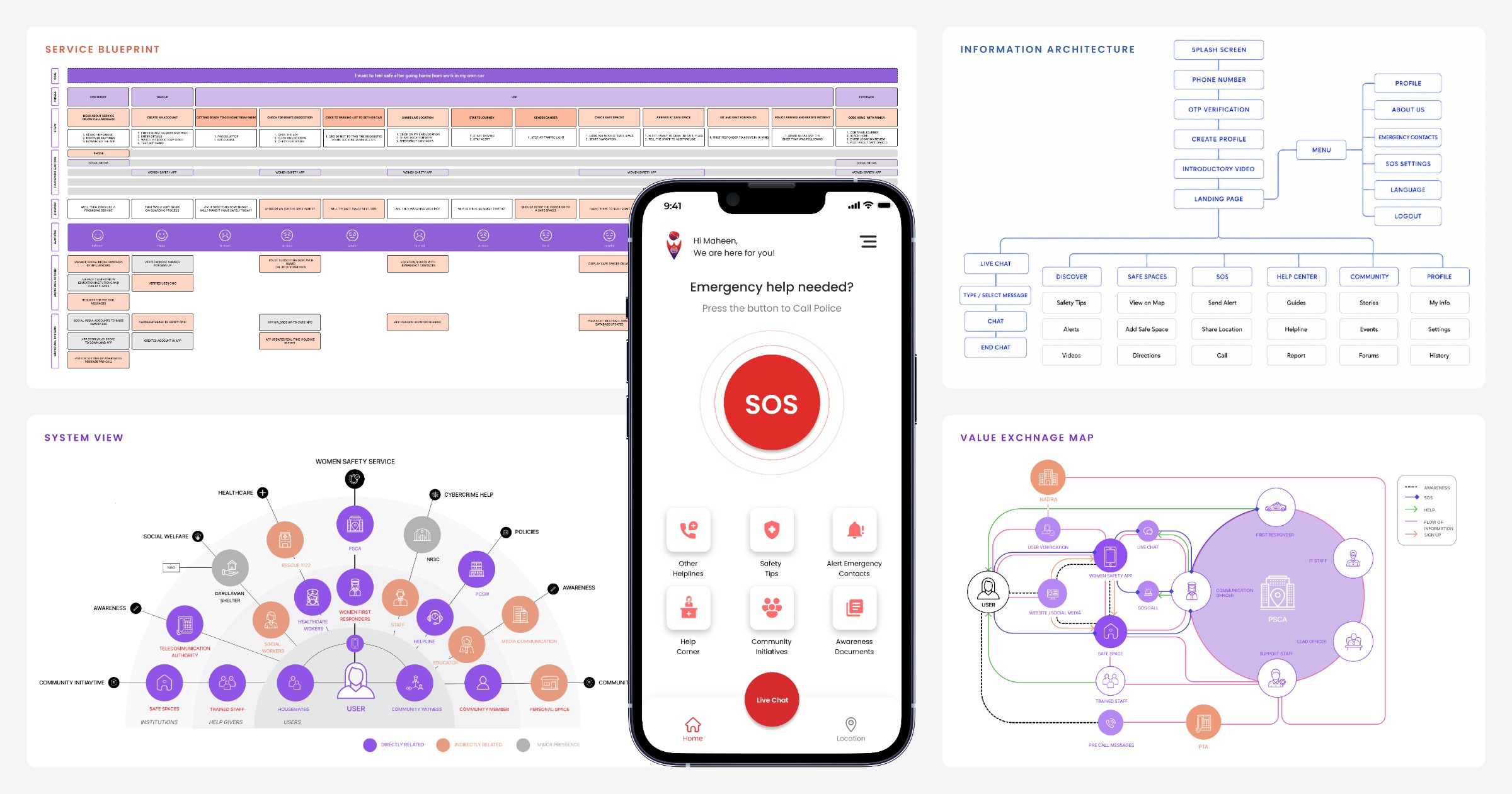
Service design process overview, the service journey, information architecture, system view and value exchange map around the app home screen
05 · The redesigned app

One unmistakable action, and everything else one tap away.

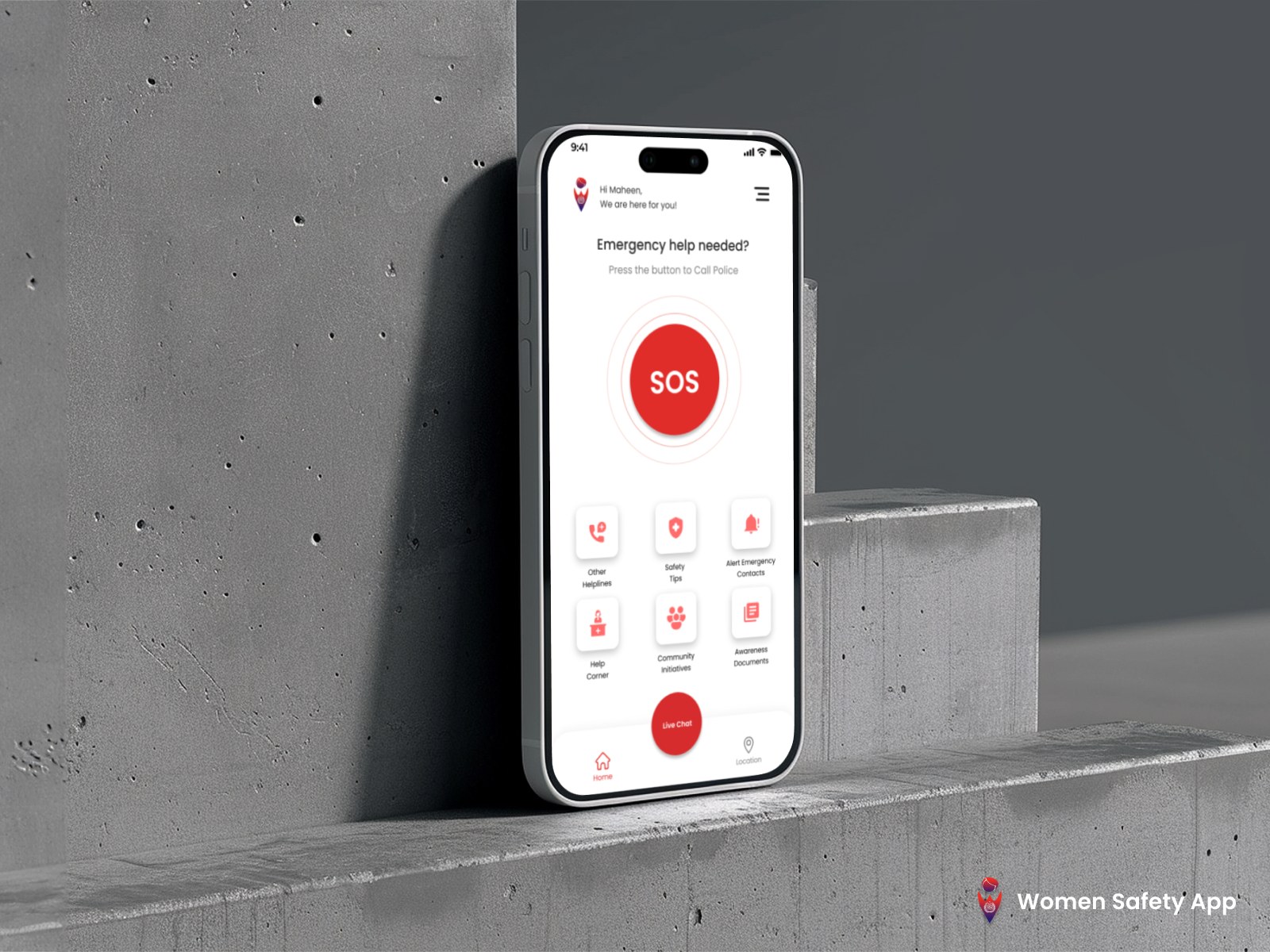
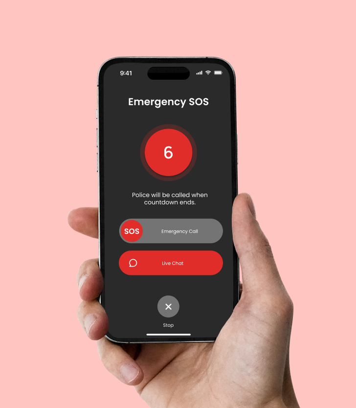
The 2020 app buried the alert among competing options and shared a location only while a call was live. The redesign puts SOS at the centre, adds a countdown for accidental presses, and keeps chat, location and safe spaces permanently within reach.
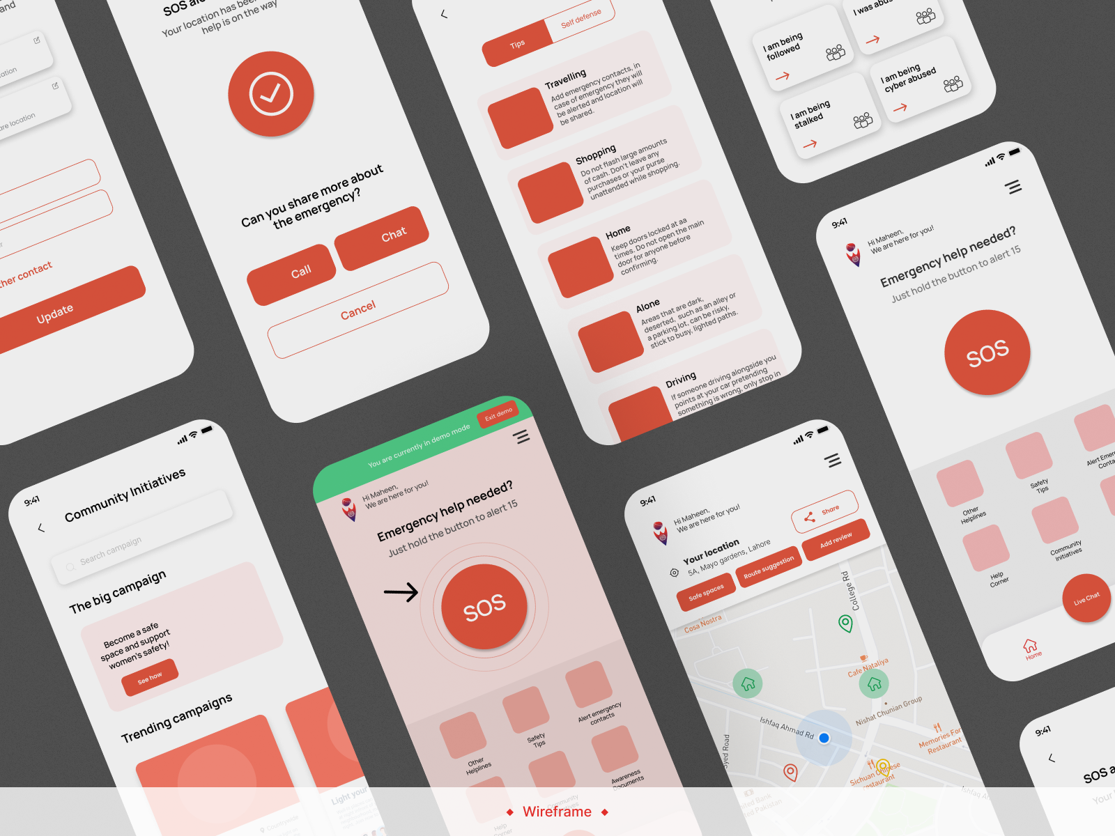
Wireframes of the redesigned app
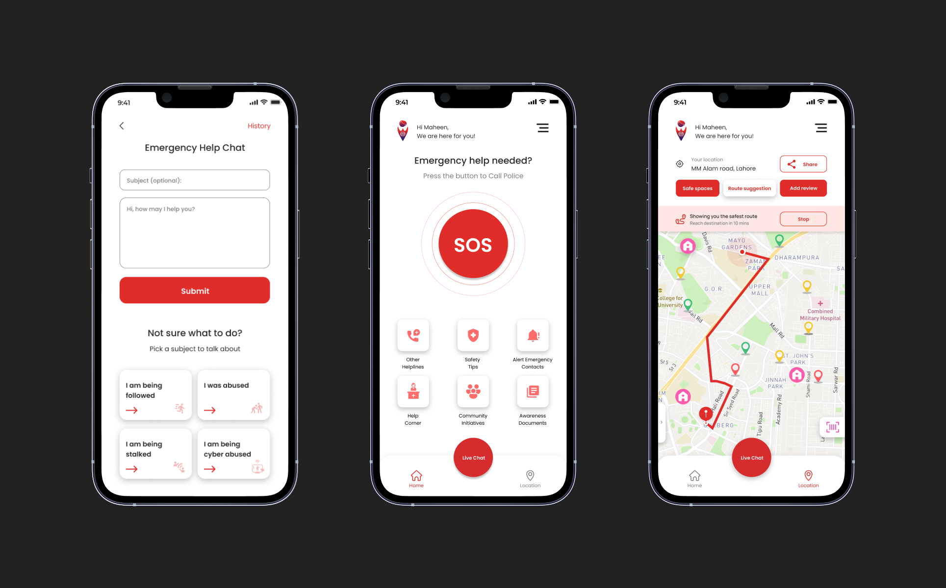
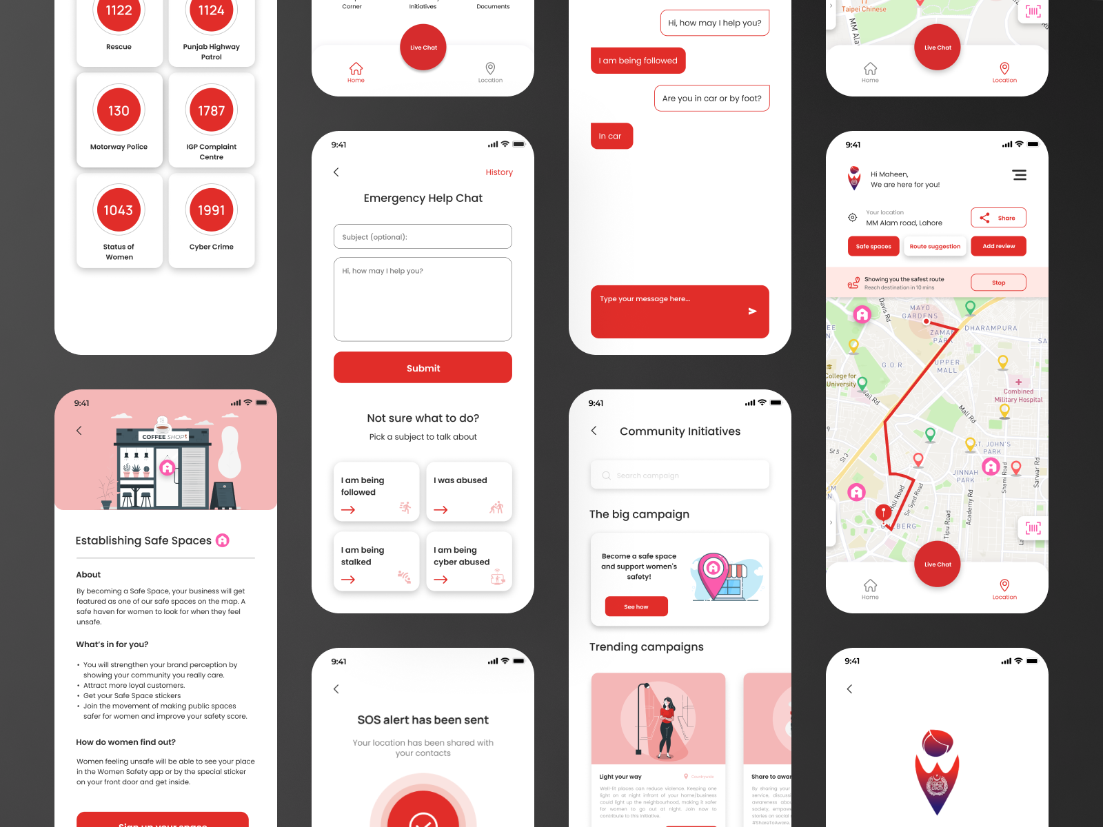
Final high fidelity screens, helplines, emergency help chat, safe space sign up, community initiatives and safest route map
The app home screen on a phone resting against a concrete wall
The Emergency SOS countdown in hand, police called when the countdown ends, with emergency call and live chat below
What changed

Every change answers something the research found.

Drag across the comparison below to see the 2020 app against the redesigned concept.
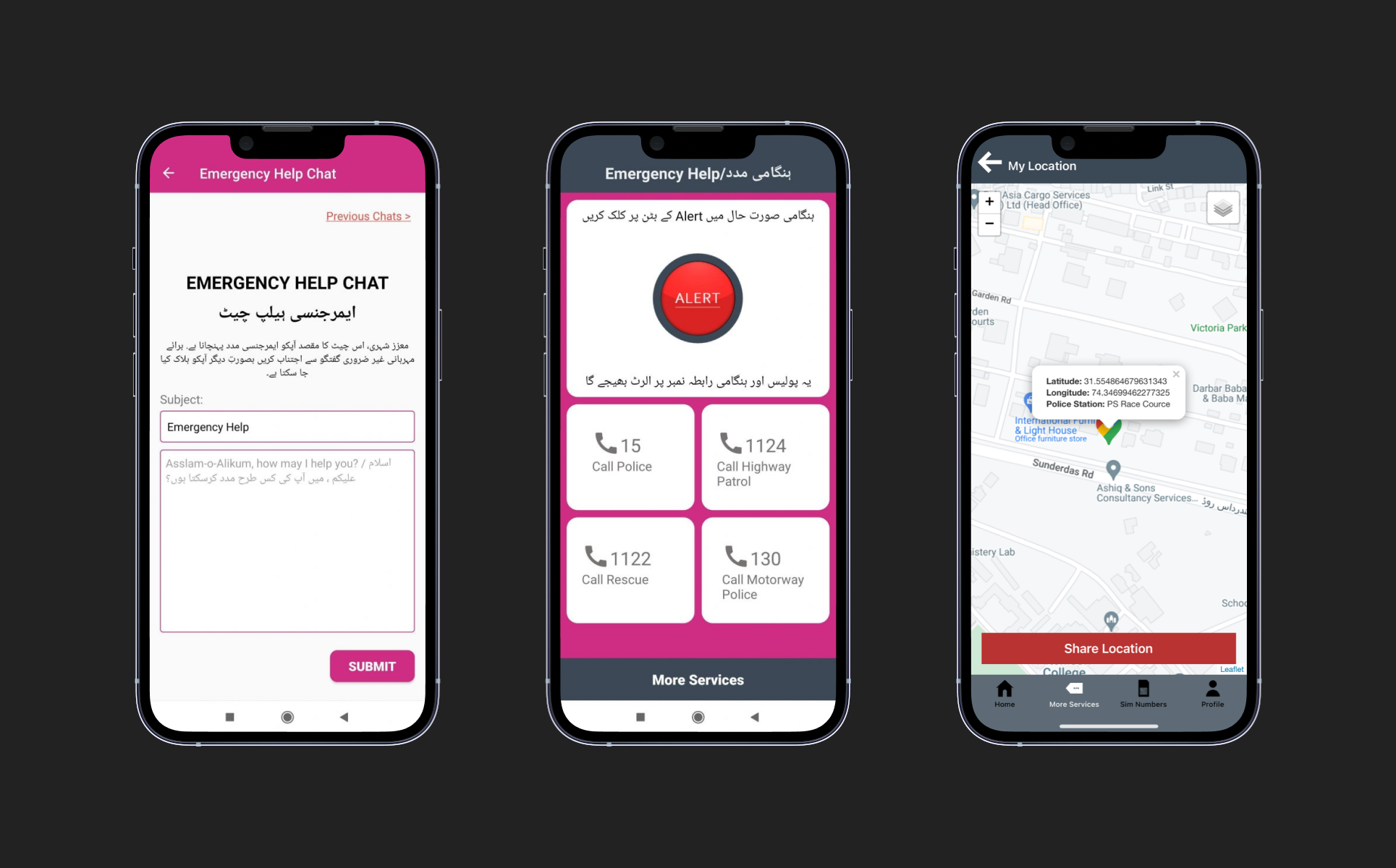
The original Women Safety app, emergency help chat, alert screen and location screen
The redesigned app, emergency help chat, home with SOS and the safest route map
2020
REDESIGNED
App feature
Before
After
Why it matters
User verification
None
NADRA verified
Eliminates hoax calls through the app
Onboarding
Intro video
Demo mode
Rehearses the emergency before it happens
SOS
Instant call
SOS countdown
Buffer time when the button is pressed by accident
Live chat
No prediction
Predictive text
Speeds up the conversation with the operator
Location
Current only
Live sharing
Loved ones can follow the journey, not just police
Routing
No suggestion
Route suggestion
Points the user to the safest way home
06 · Beyond the app

Interface work alone could not fix reliability.

So the proposal reaches into the organisation: women First Responders trained through a two-month gender-responsive policing programme, PTA-carried pre-call awareness messages on every connected call, and NADRA verification behind sign-up. A revised service blueprint and value exchange map traced the new flow of trust between women, businesses and the authority.
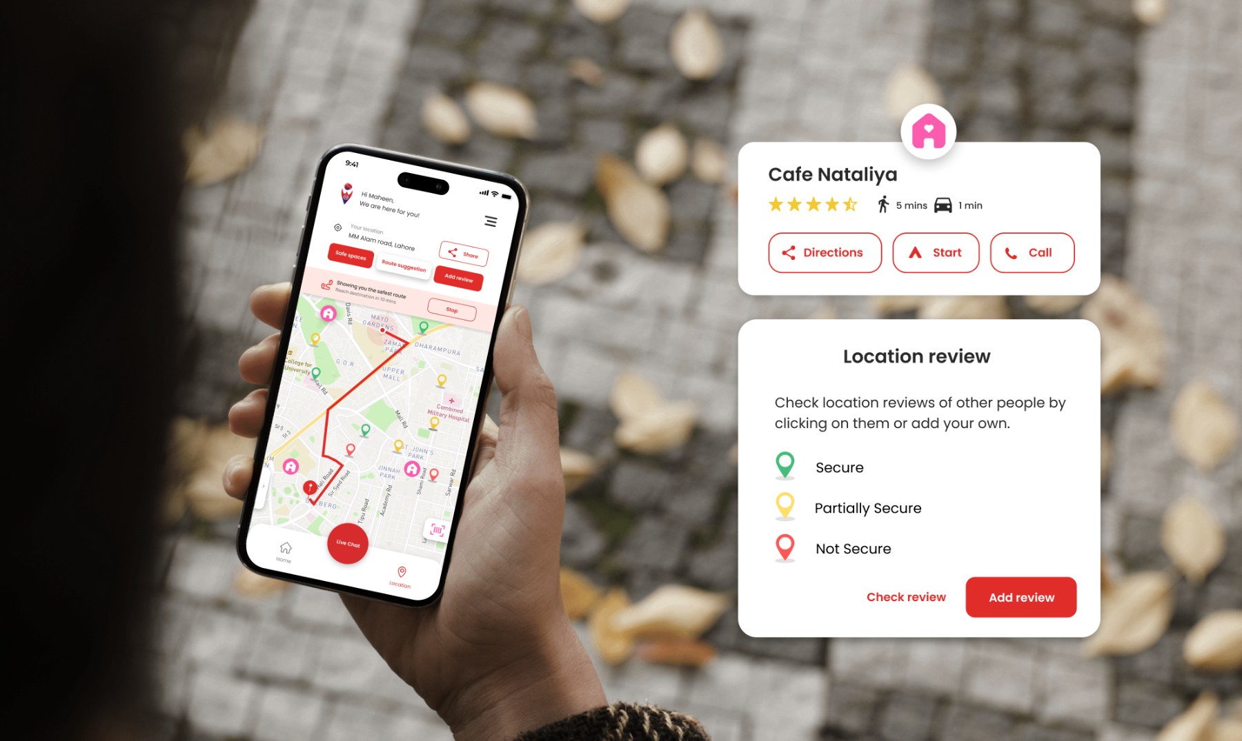
Where the digital and physical halves meet
Safest route
Not the fastest way home but the safest.
Safe Space pins
Refuges visible before they are needed.
Location reviews
Secure, partly secure or not, by women who were there.
Live sharing
Contacts follow the whole journey.
The safest route on the map with Safe Space pins, a location card for Cafe Nataliya and the location review legend
Scan to verify

Feeling unsafe? Come inside.

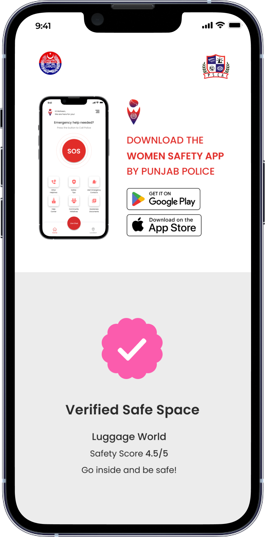
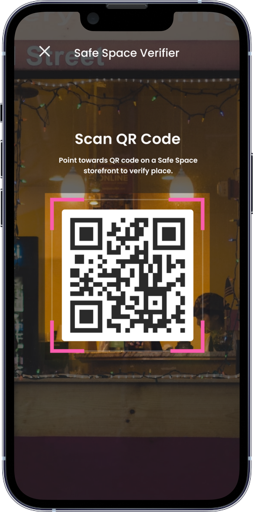
A woman passes a shop carrying the Safe Space poster, points her phone at the QR code, and the app confirms the place is registered, with a safety score from the women who have been there before her.
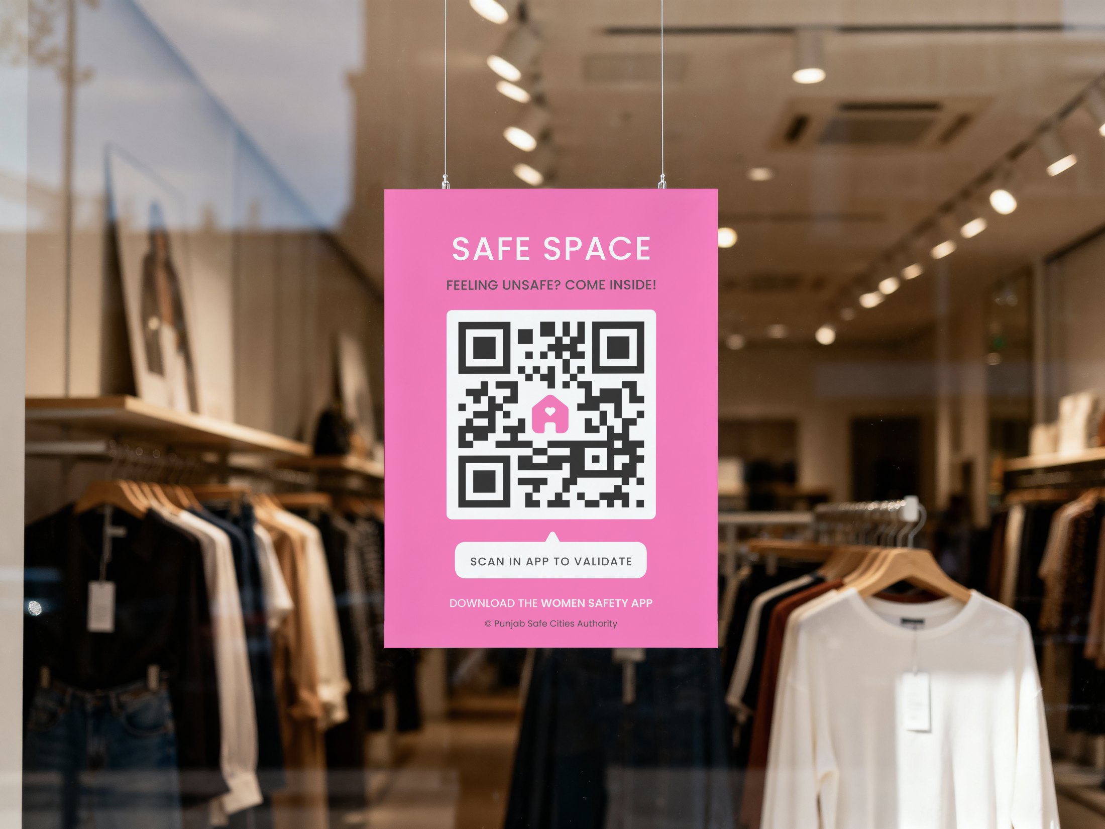
A Safe Space poster with a QR code hanging in a lit shop window
The Safe Space verifier on a phone, point towards a QR code on a Safe Space storefront to verify the place
Verified Safe Space, Luggage World, safety score four and a half out of five
Scan to verify
A woman passes a shop carrying the Safe Space poster.
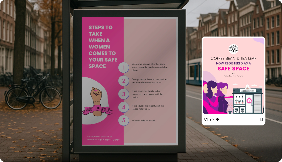
Bus stop poster with steps to take when a woman comes to your safe space, beside a social post announcing a registered Safe Space
Creating awareness

A service 70% of women had never heard of.

That cannot be fixed by improving its screens, so awareness became a design surface of its own.

In public space
Posters set out the five steps to take when a woman comes to your Safe Space.
Online
Registered businesses announce themselves on social media so it reaches the audience.
Try the prototype
Walk the redesigned app end to end.
Open in Figma ↗
Outcome

A service women can see, trust and reach before the emergency.

One under-used app becomes a network of touchpoints, digital, physical and organisational, reachable before, during and after a moment of risk. What follows are the outcomes the proposal is designed to produce, not metrics from a live deployment.

Accidental activation reduced
A countdown before the call replaces the instant dial that made most helpline traffic accidental.
Anonymous misuse eliminated
NADRA verification behind sign-up removes the hoax calls that were consuming response capacity.
Trust rebuilt through people
Female First Responders and a two-month gender-responsive programme answer the discomfort of reporting to male officers.
Emergency support extended into the street
Registered Safe Spaces give a woman somewhere to go in the minutes before help arrives.
The service shifts from reactive to preventive
Demo mode, safer routes and reviews move support upstream, to the decisions taken before anything happens.
Next project
North American Tutors →
Back to all work

Have something worth building well?

Tell us what you are building. We reply within two working days.

Start a project