
Syntax Technologies
Syntax teaches working professionals three ways at once: mentor-led fellowships, short live workshops, and self-paced courses. We redesigned the web experience around the one question the site never answered: which of these is right for me.
Web experience
UI · Design system
Course architecture
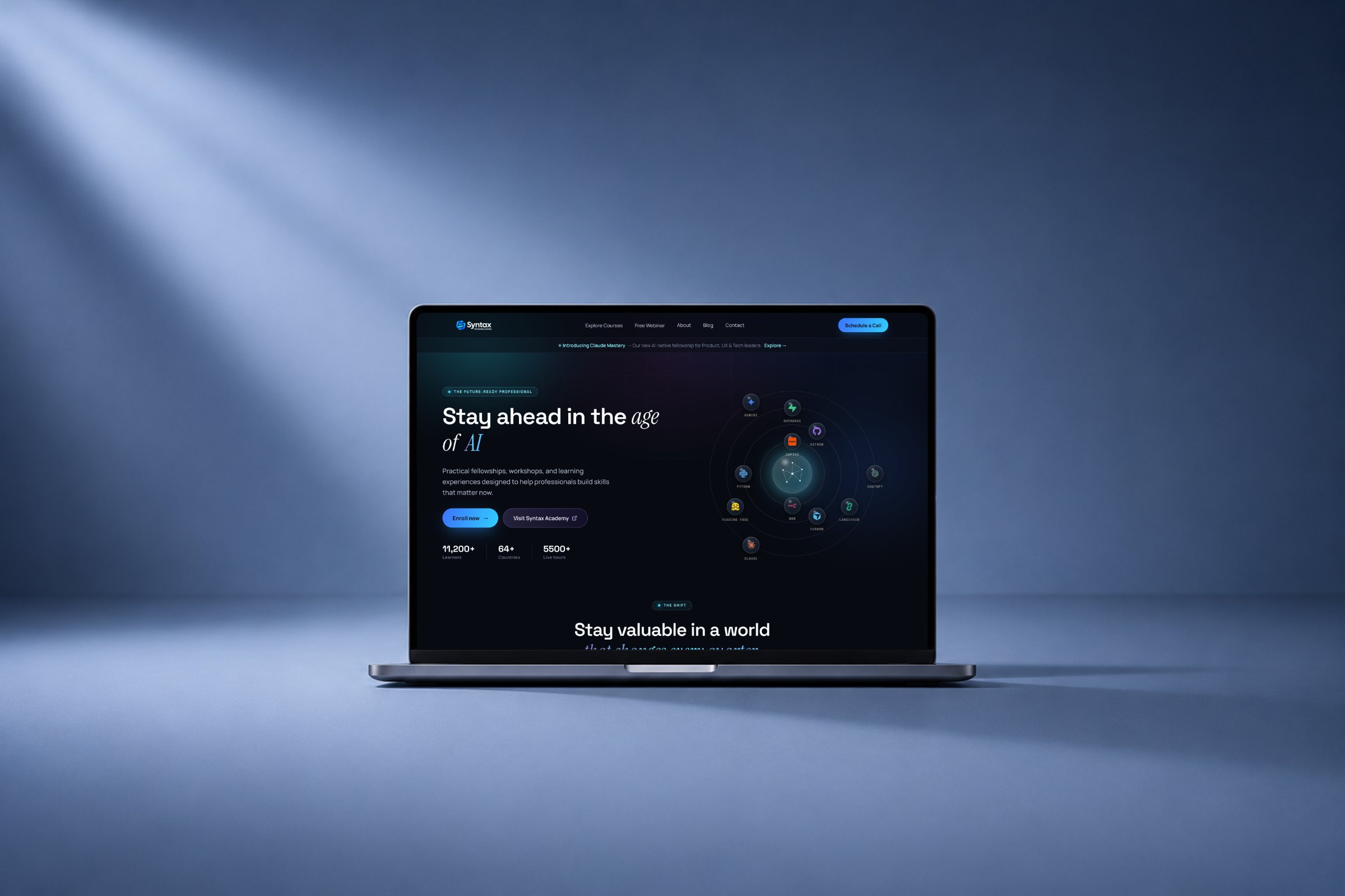
Three ways to learn, and no clear way to choose.
Everything Syntax offered arrived in one long scroll. A fellowship is sixteen weeks with a mentor. A workshop is an afternoon. Listed as a single catalogue, none of that was visible.
These are people who work in tech, with a gap to close and little spare time. The site had to answer how deep, how long, and can I do this alongside my job.
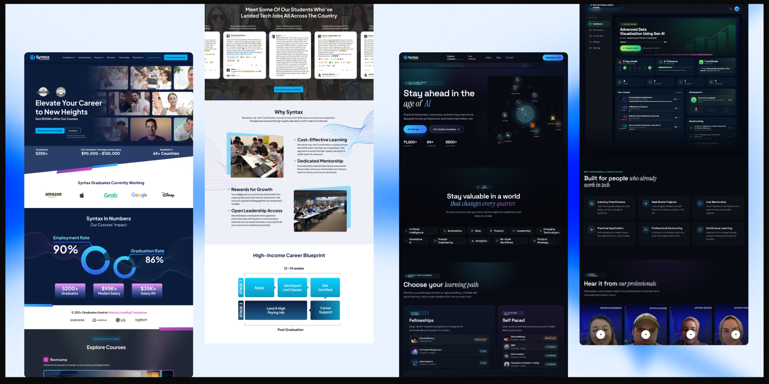
The catalogue did not need fewer courses. It needed a first decision that was easy to make.
Sort by how someone wants to learn, not by what we sell.
We split the catalogue into three named paths, each stating its commitment up front. The first decision is made on time and depth: what these visitors are actually weighing.
Sixteen weeks with a mentor and a cohort. The deepest option, for changing what you do.
Eight modules, no cohort and no dates. Start tonight, move at the speed the week allows.
One live session with an instructor. For the skill you need this month.
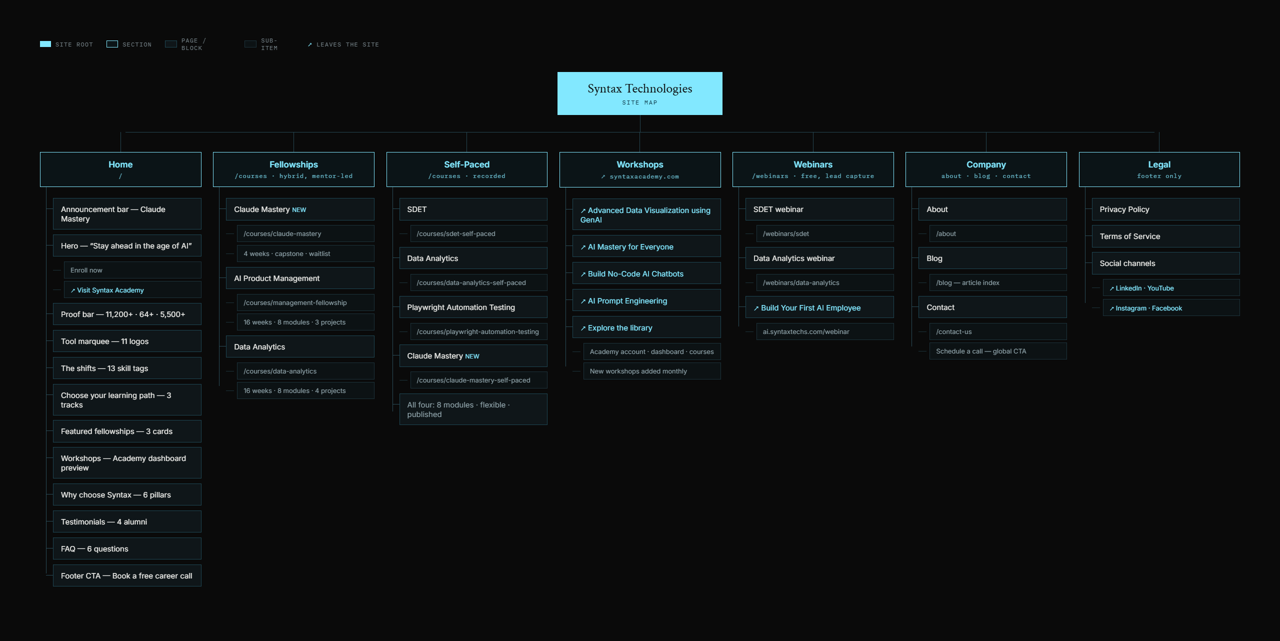
The same three decisions, carried through the whole site.
We redrew the site around the three formats, with webinars and the learner account as their own branches. Every route resolves to a course page or the dashboard.
The proof that used to open the homepage still exists, further down, where it supports a decision instead of delaying one.
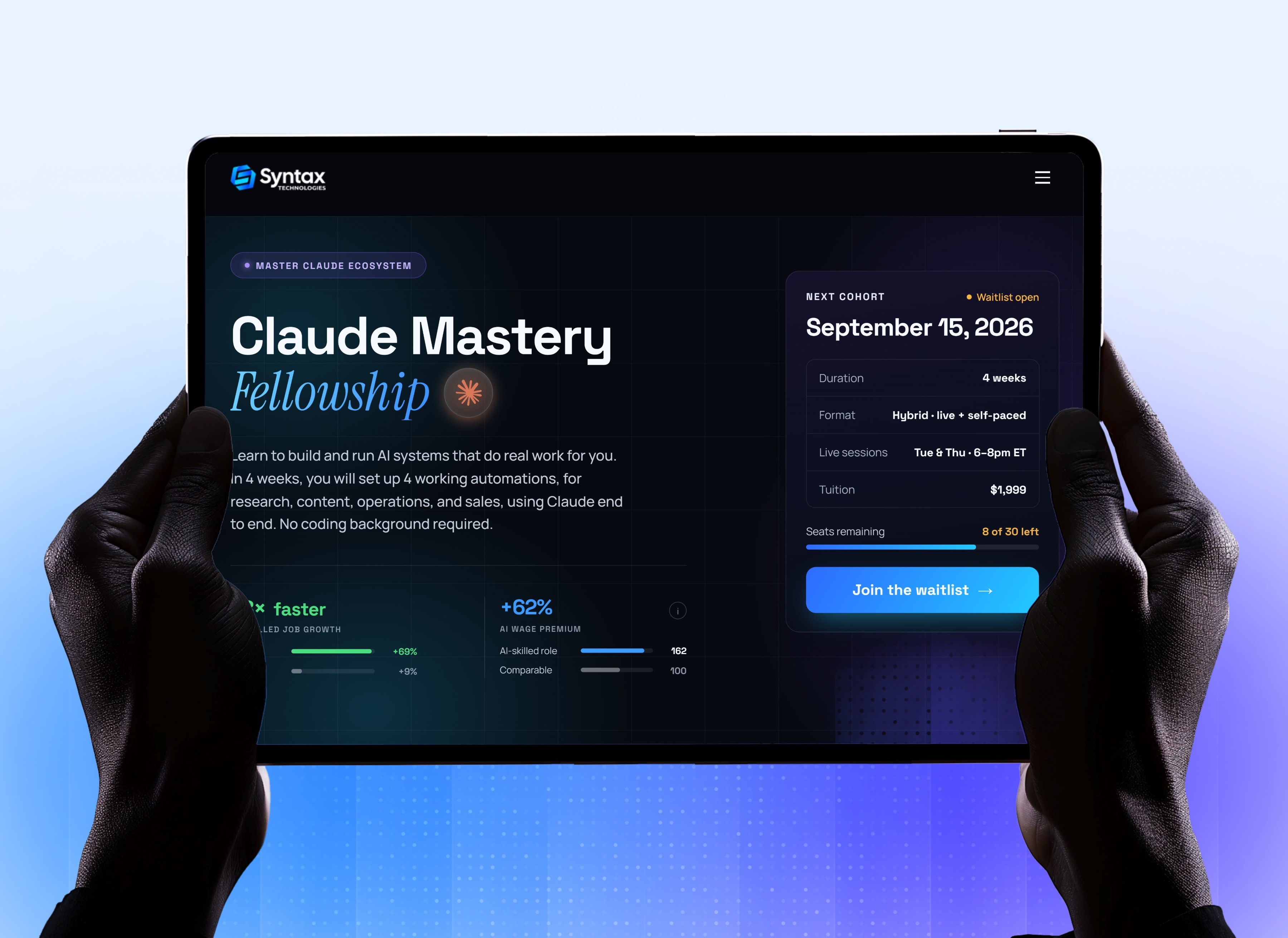
The page where a maybe becomes a yes.
Every path narrows to one course, and this page answers the last questions: when it starts, how long it runs, and what it costs. Those facts sit beside the title rather than under the syllabus.
Below them the syllabus does the persuading, module by module, in the same cards and badges as the path tiles that led here.
One type scale and one palette, so every page reads as the same company.
Three formats meant three sets of pages, and left alone they would have drifted apart. One type scale and one colour system now cover all of them.
Space Grotesk sets headings, Manrope carries body text, and a serif appears once a page. Navy is the base; the bright blue is held back for buttons and links, so an action always looks like an action.
abcdefghijklmnopqrstuvwxyz
0123456789
abcdefghijklmnopqrstuvwxyz
0123456789
abcdefghijklmnopqrstuvwxyz
0123456789
abcdefghijklmnopqrstuvwxyz
0123456789
abcdefghijklmnopqrstuvwxyz
0123456789
abcdefghijklmnopqrstuvwxyz
0123456789
Primary accent
Primary accent
Signature gradient
Progress should be as easy to read as the choice was to make.
Signing up is one decision. Coming back after a busy fortnight is the one that decides whether someone finishes.
So progress, streak, certificate and what comes next are held in one state. A learner returning after a week does not have to reconstruct where they were.
A catalogue becomes a set of decisions a busy professional can actually make.
Syntax now asks visitors to make four decisions in order: how they want to learn, what they want to build, which course fits, and where they are in it, instead of asking them to understand everything first.
Naming the three paths did most of that work. Once format is settled, the subject choice gets simple and the depth signals do the persuading.
Have something worth building well?
Tell us what you are building. We reply within two working days.
Start a project →