JazzCash
Millions of people in Pakistan meet digital finance for the first time inside this app. We audited it end to end, then rebuilt the three places it loses people: signing up, arriving home, and finding a service.
Product design
UI · Prototype
App architecture
July 2024
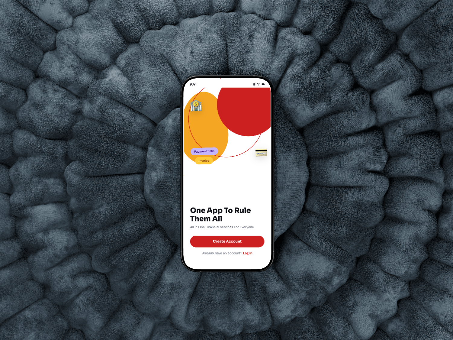
Thirty six screens you can actually use.
Everything in this study was tested as a working build, not a picture of one. Sign up, send money, pay a bill, switch to dark mode. It responds the way the shipped app would have to.
Tap inside the phone to move through it.
The app works. It just asks for patience at every turn.
JazzCash carries real weight in Pakistan. It is the bridge between cash and a bank account for people who have never had one, and most of them are using it on a mid range Android with an unreliable connection.
Nothing in the app is broken in a way that shows up in a bug report. It is worse than that: a pre-filled field to delete, a button that expires while you read, a popup that hides its own last row. Each one is small. Together they teach people that this app is hard.
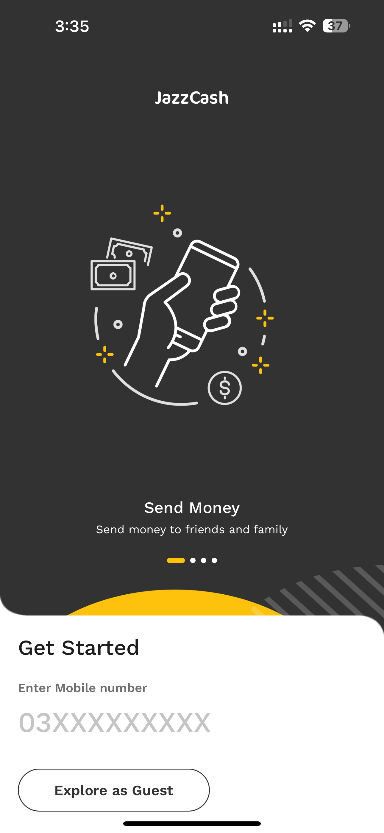
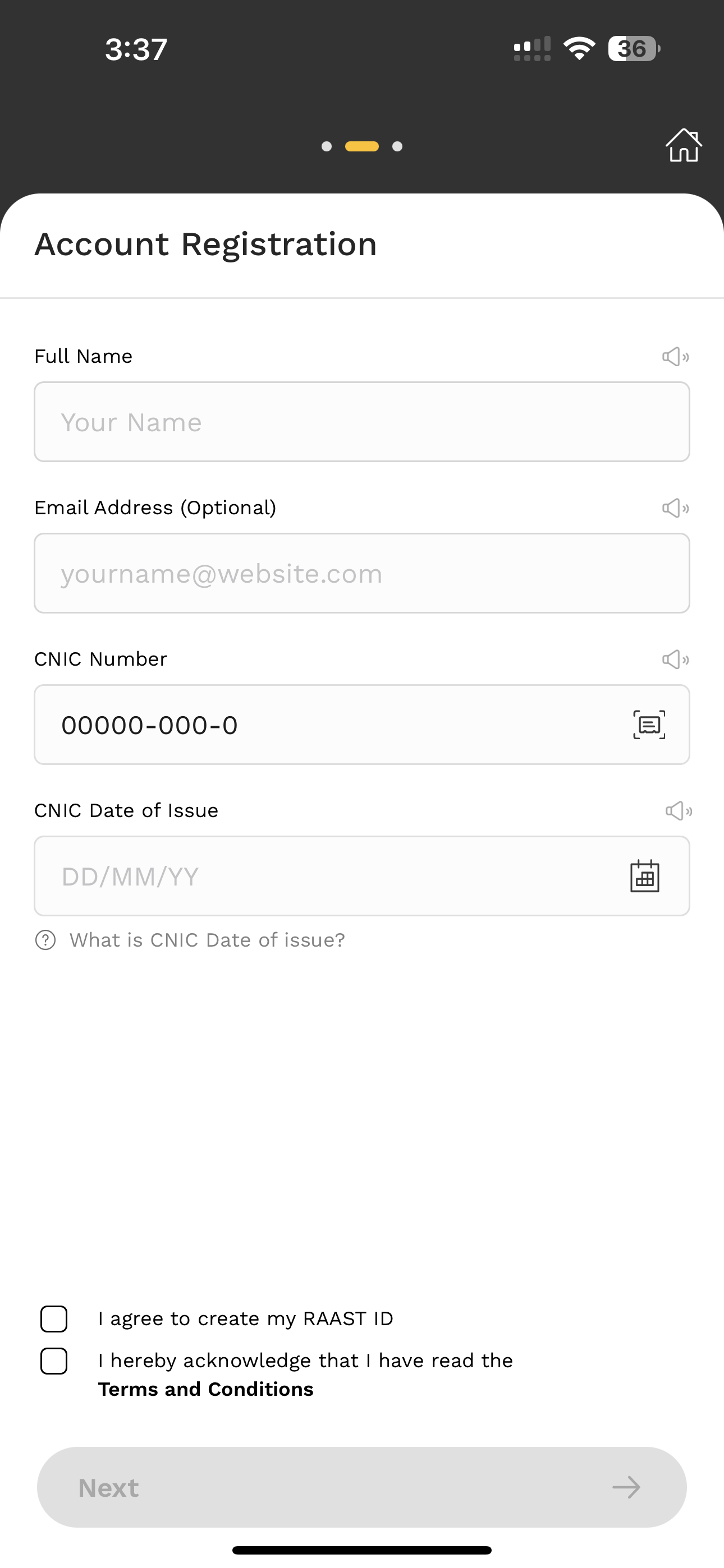
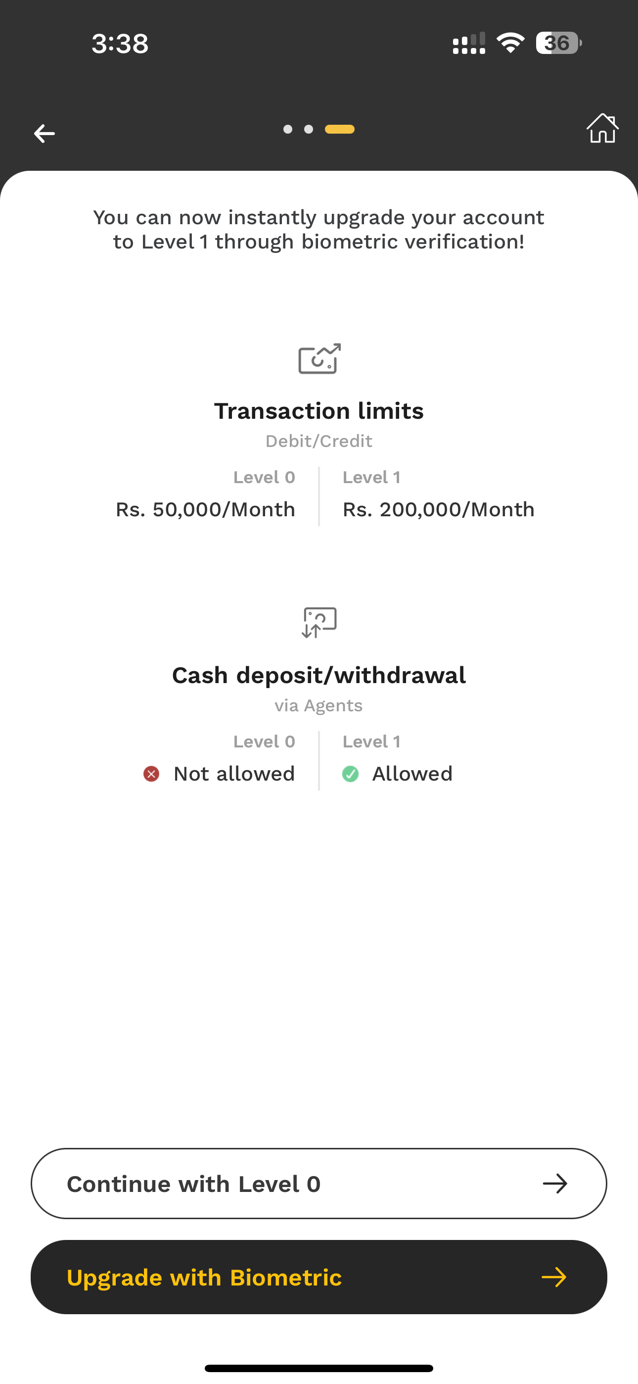
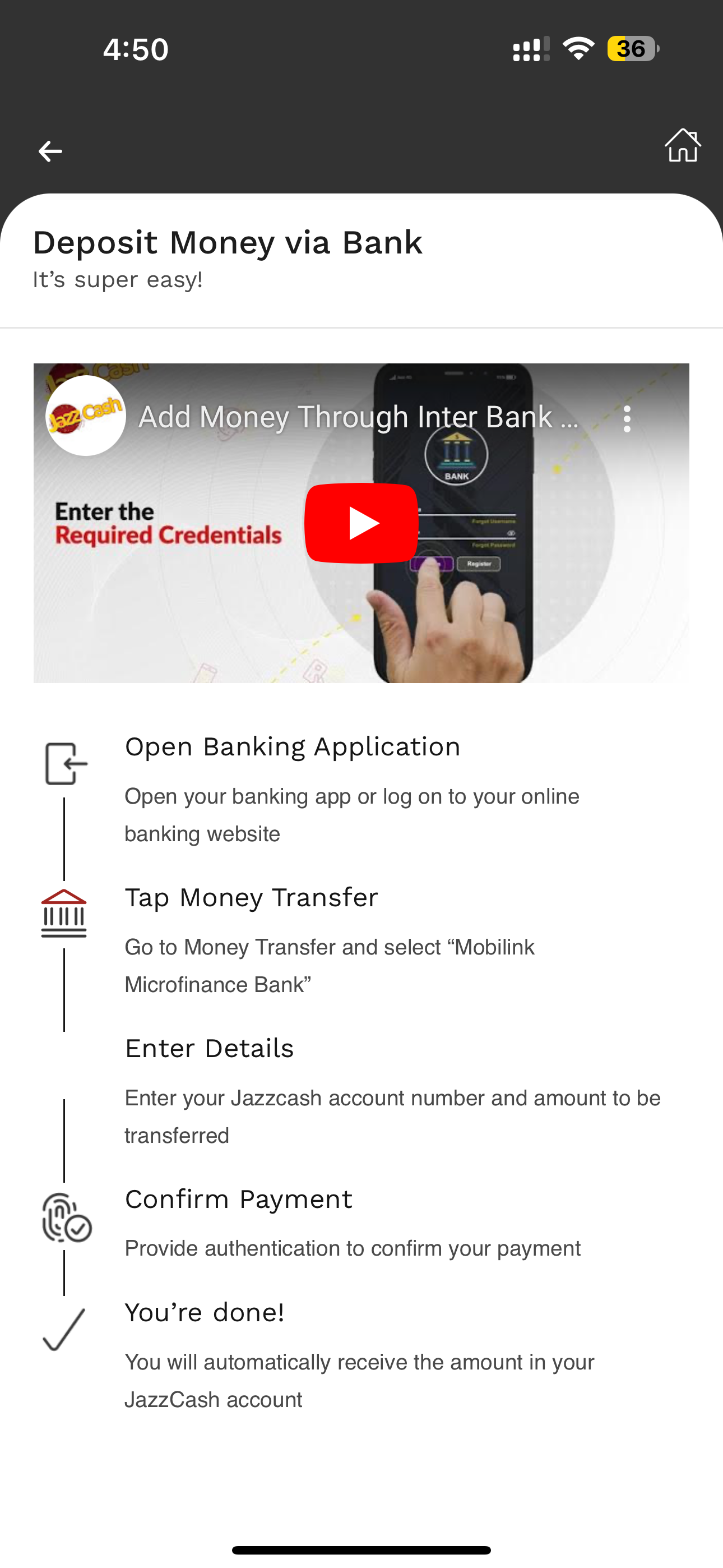
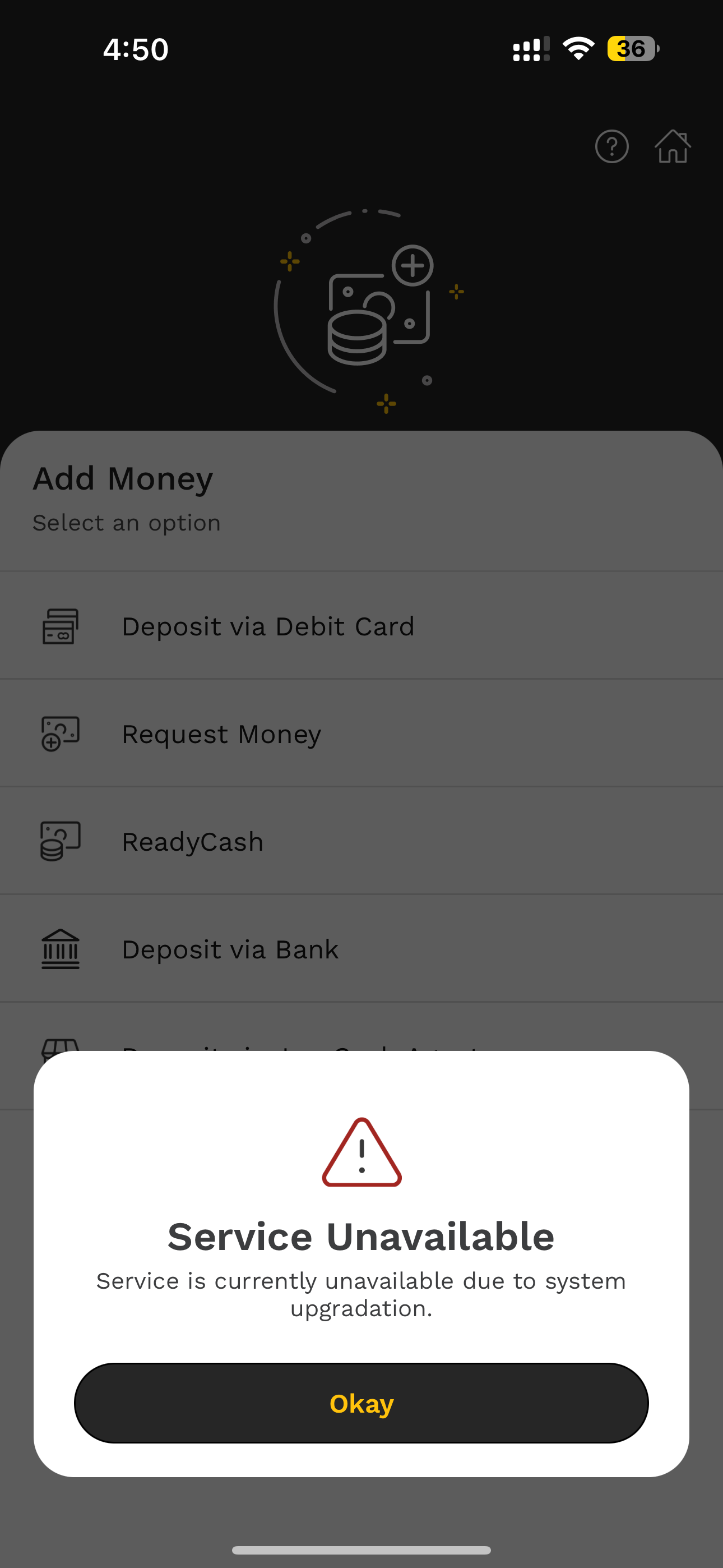
Captured from the live iOS app during the audit.
Four passes over the same app, each one catching what the last missed.
Living in the app finds the friction. Watching someone else use it finds the confusion. A heuristic pass names the cause, and the market shows what people already expect a wallet to do.
We used the app as a customer for weeks, on iOS, logging every hesitation rather than every bug.
A moderated session on ordinary tasks: open an account, add money, pay a bill. We noted where hands stopped.
Every screen read against established usability principles, so each finding had a named cause and a fix.
Four local wallets and two international banks, read for the conventions their customers now take for granted.
A wallet earns trust the same way a bank does. By never making you wonder what just happened.
The first four screens decide whether there is a fifth.
Signing up meant clearing a pre-filled CNIC, guessing what an MPIN is, and racing a continue button that disabled itself while the code was still arriving. Miss it and the whole flow starts again.
We rebuilt it as four honest steps with a visible position in the sequence, plain language for every term, and a code screen that waits as long as it takes.
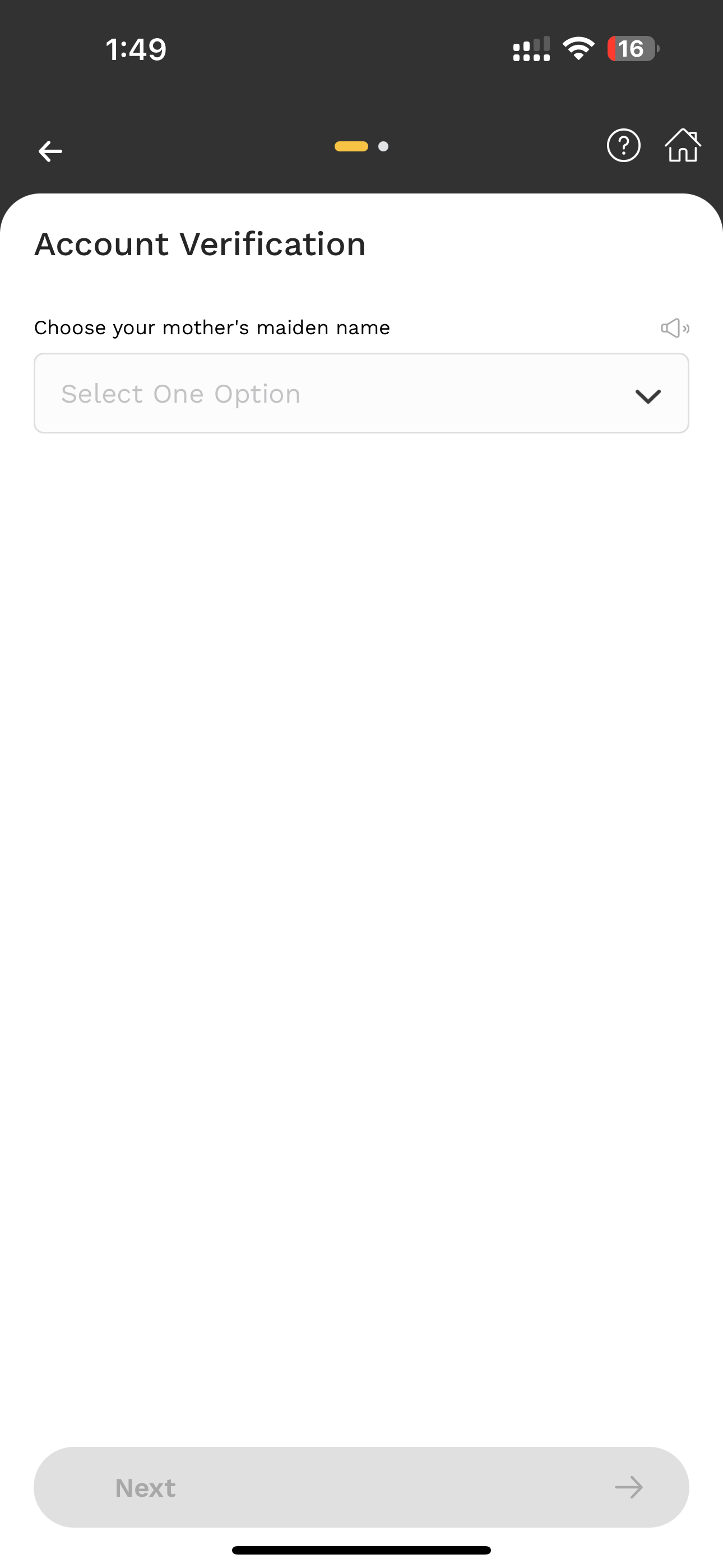
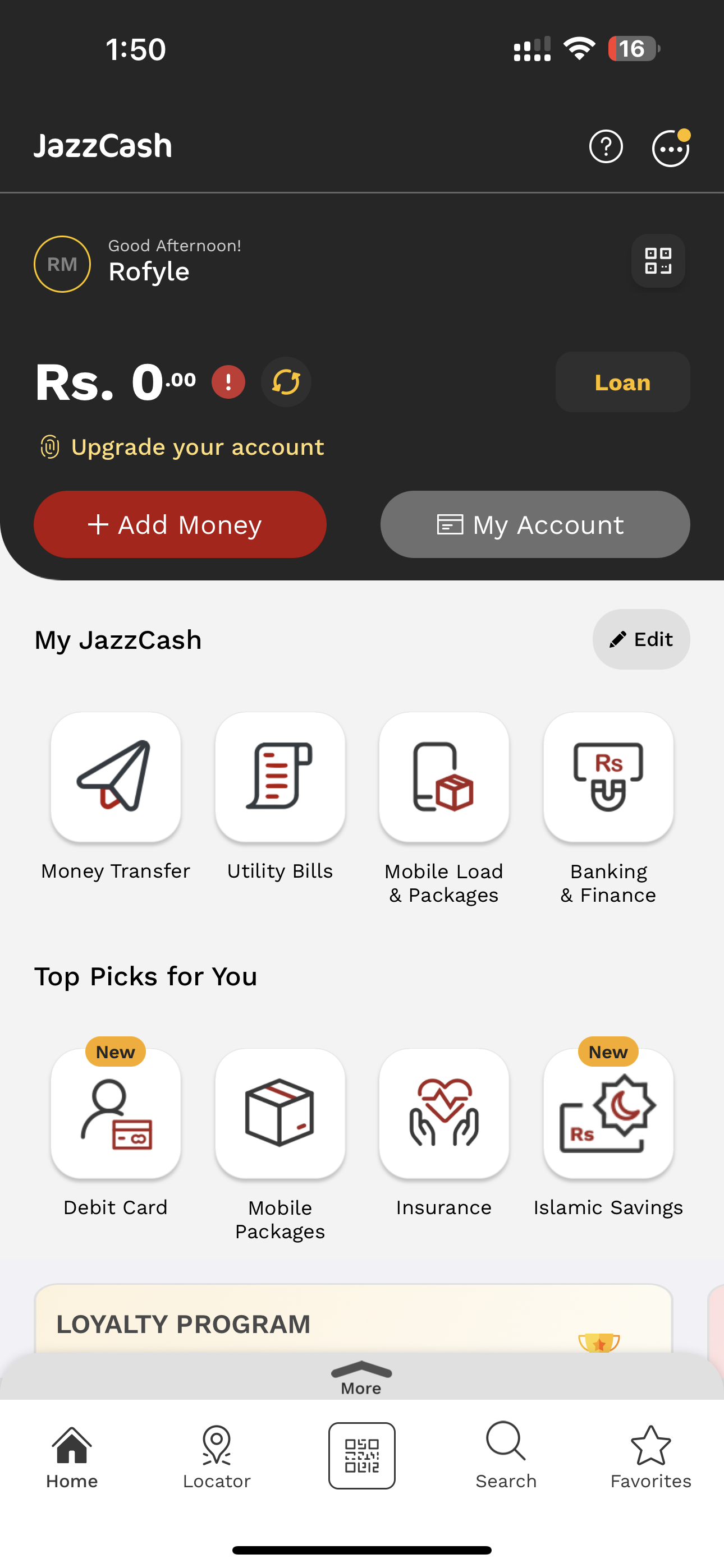
Everything on offer, and nothing about your money.
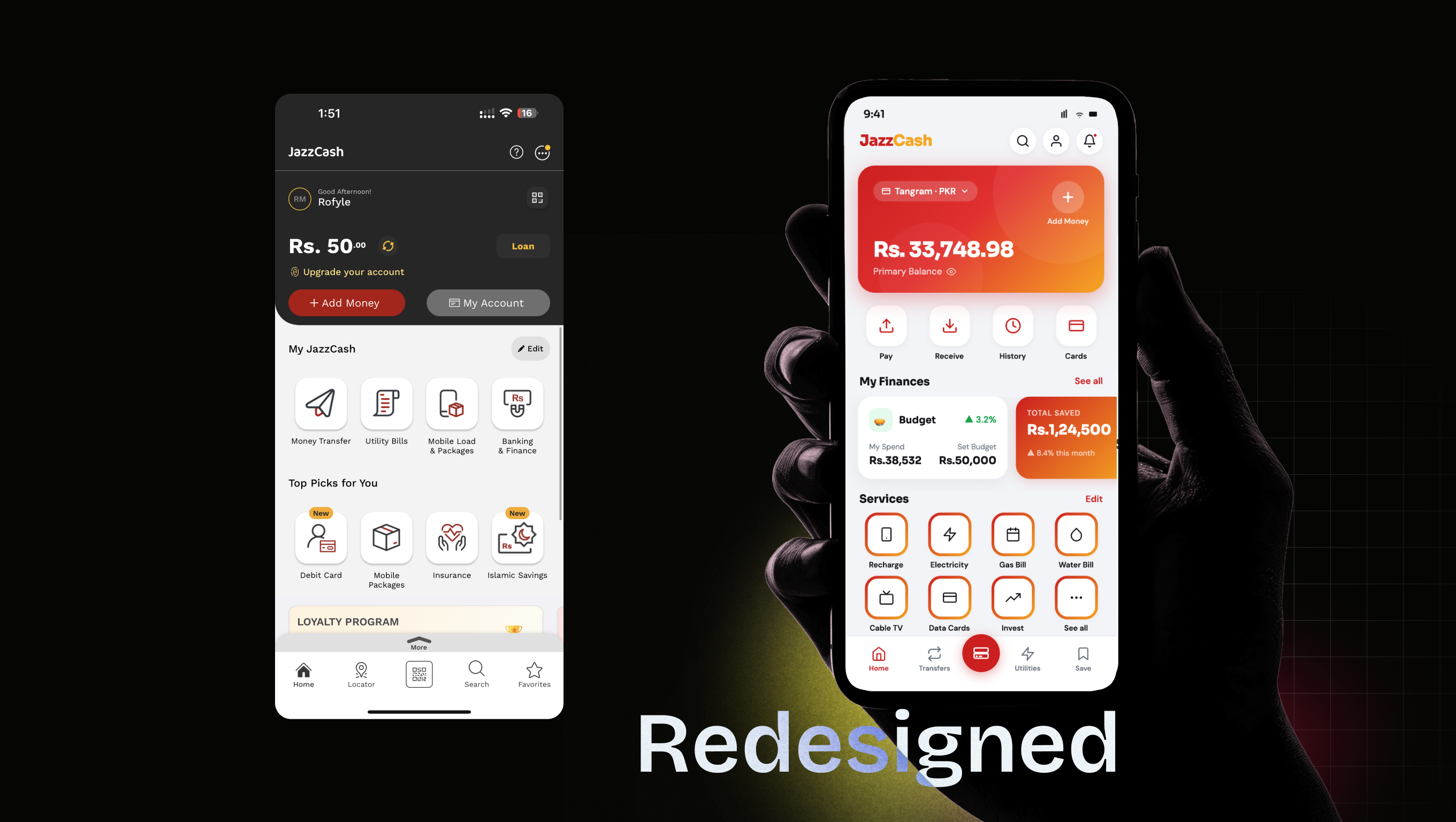
The home screen led with services to sell and top picks that rarely fit. What people came for, the balance, what just went out, and what is due, was either absent or a tap away.
We put the account first: balance, the last few transactions, then four actions people actually repeat. Everything else moved behind one honest door called all services.
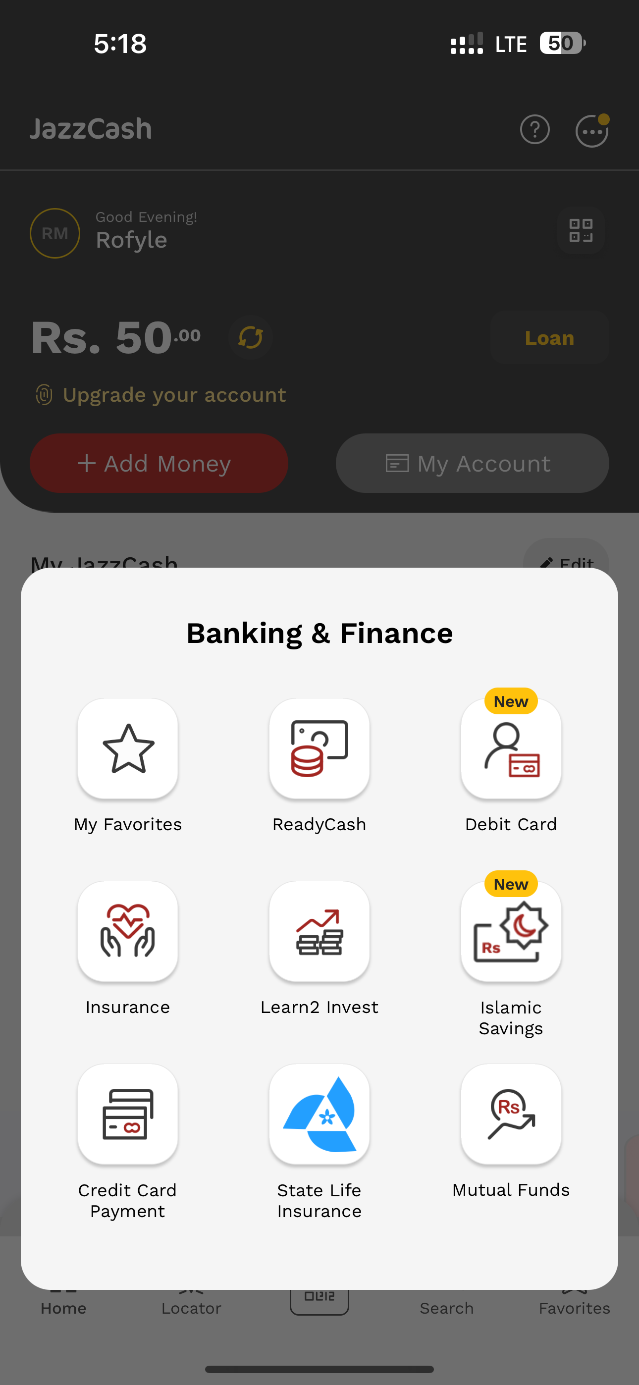
Let people shape the app around the four things they do every week.
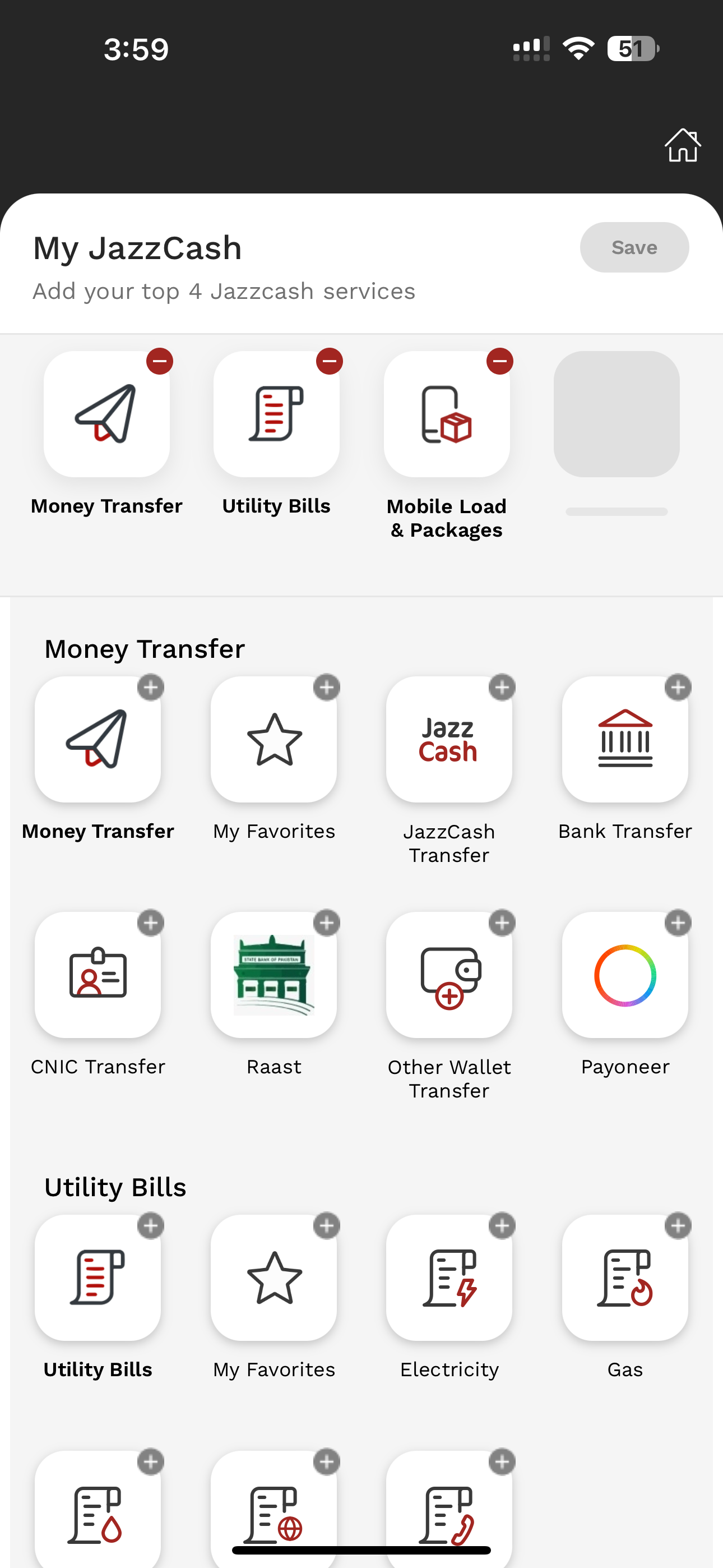
Customisation existed, sort of. Editing the shortcut grid put pixelated grey add icons on screen and gave no sense of what saving would do. Nobody uses a feature they cannot predict.
We made shortcuts, theme and dark mode explicit, and gave failures a way out. A service that is down now offers an alternative and a route back, rather than one Okay button.
Thirty six screens, five sections, one route to each of them.
A wallet grows by accumulation, and the map is where that shows. We drew the whole app, grouped every screen under the intent it serves, and gave each one a single home. The result is a structure the product team can add to without another popup.
Most of this is already settled elsewhere.
Six apps, read for one thing each. Not to copy them, but to see which conventions a Pakistani wallet customer now arrives already expecting.
No tiles behind the icons. Dropping one layer of decoration makes the whole home screen quieter.
A carousel of services that admits there are more of them, instead of a slider that hides itself.
Few, large, high contrast actions. Nothing on the home screen is smaller than a thumb.
Recent transactions on the home screen, so the first question a customer has is answered on arrival.
Widgets and a theme the customer chooses. The app arranges itself around the handful of things each person repeats.
Onboarding one step at a time, in plain language, with fees and security stated before they are agreed to.
Four rules, applied to all thirty six screens.
The prototype has not shipped, so there are no numbers to quote. What it does have is a position on every decision, and these four rules settle the arguments that come next.
Every screen has a back. No button expires while someone is reading it, and no failure ends in a single Okay.
MPIN, Level 0, RAAST. Every term either gets explained where it appears or gets replaced with plain language.
Balance and recent activity lead the home screen. Services earn their place by being used, not by being new.
If a surface scrolls, it shows it. If a section holds more, it says how much. No feature depends on a guess.
Have something worth building well?
Tell us what you are building. We reply within two working days.
Start a project →