Shantellé
A premium bridal and formal wear label, given a timeless yet modern digital identity. Branding, a custom Shopify storefront, and ongoing content direction, shaped so every touchpoint carries the same elegance as the clothes.
End to end
UI/UX · Creative direction
Content system
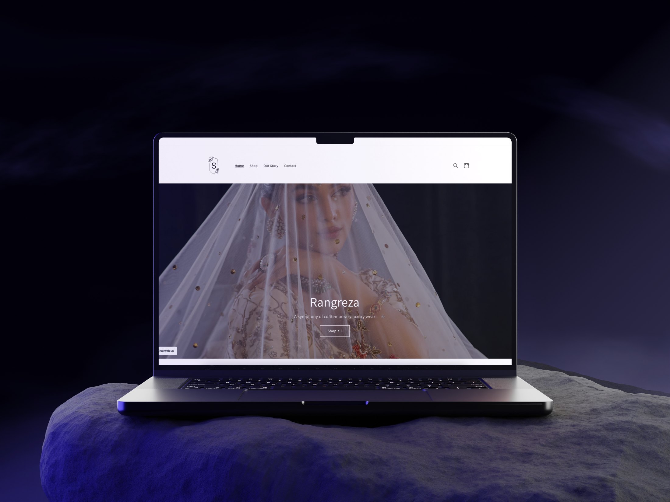
A clothing label, but the brand had to feel like an experience.
Shantellé sells couture rooted in traditional craftsmanship, made for a modern woman. Nothing in its digital presence carried that. There was no visual language, no consistent voice, and no place online where the detail in the garments could actually be seen.
We worked with the founders to define that language first, from logo to tone of voice, so the identity read as sophisticated, feminine, and culturally grounded before a single page was designed.
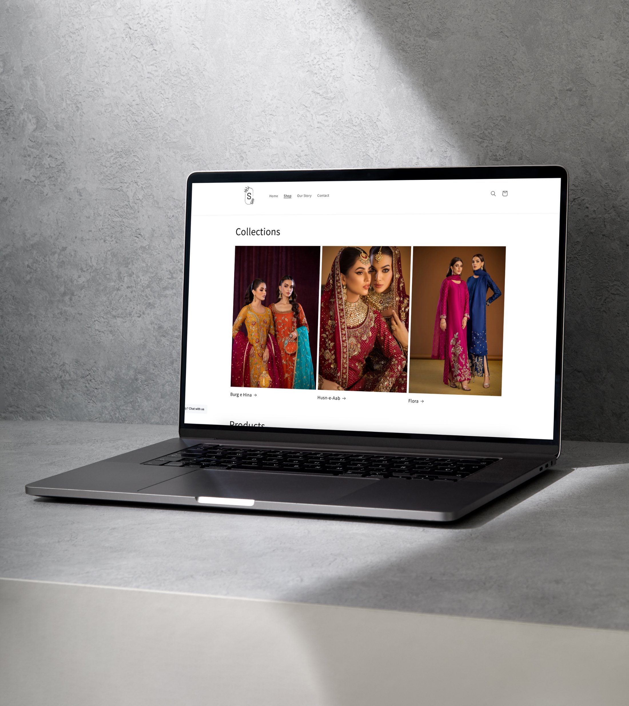
Every collection is named, styled, and positioned as its own story.
Each collection carries its own palette, typography, and campaign visuals, so browsing the shop feels like moving between chapters rather than scrolling a product list.
Shantellé isn't just a clothing label. It is an emotional experience.
A storefront built to show couture detail, not hide it.
The Shopify build is clean, elegant, and performance-driven. High-resolution imagery leads every page, collection-based filtering keeps a large catalogue navigable, and custom order support sits inside the same flow rather than beside it.
Most visitors arrive on a phone, so the mobile journey was designed first, from homepage to product detail to a checkout that keeps the brand voice all the way to confirmation.
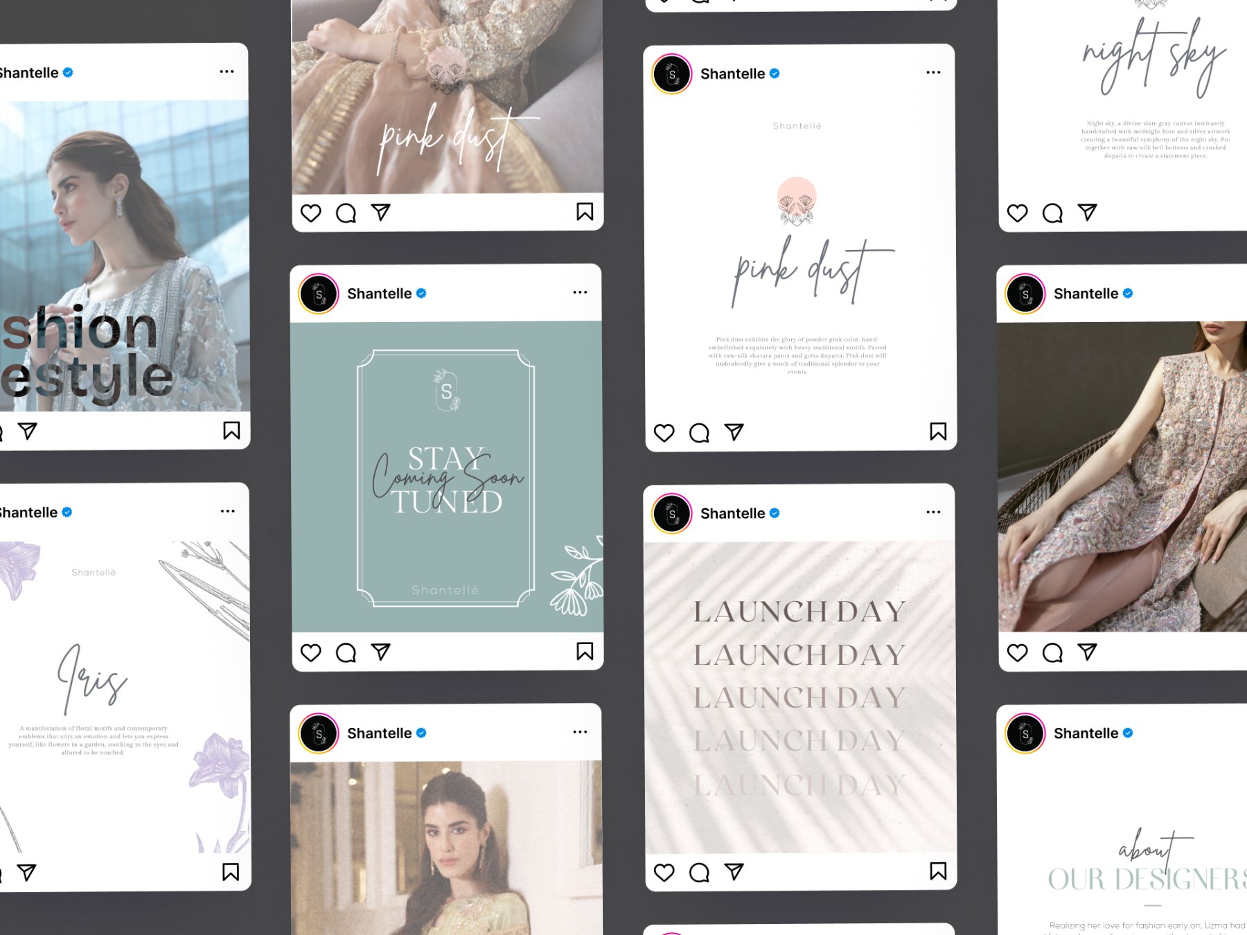
The brand does not stop at the site. Styled shoots, post templates, and monthly content direction hold the same voice across every channel, graceful, poetic, and aspirational, so a post and a product page read as one brand rather than two.
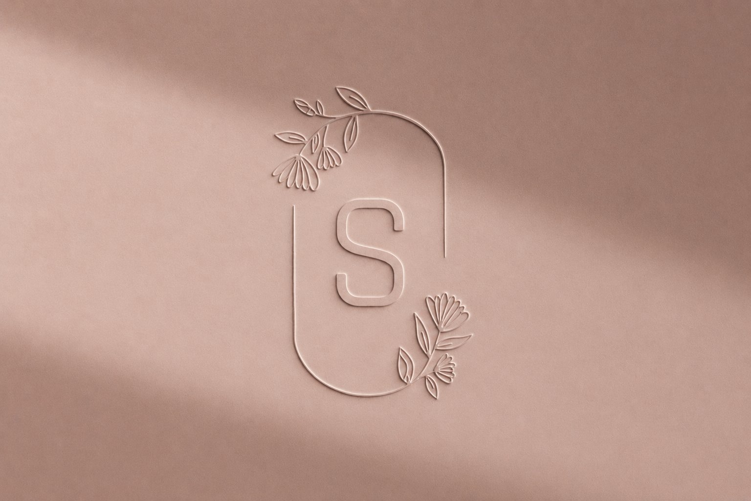
The same mark, made physical.
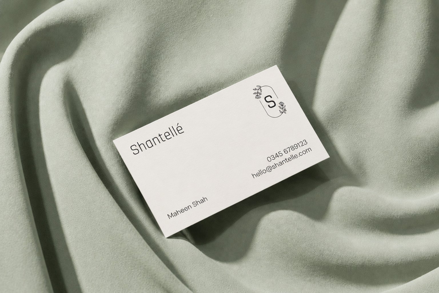
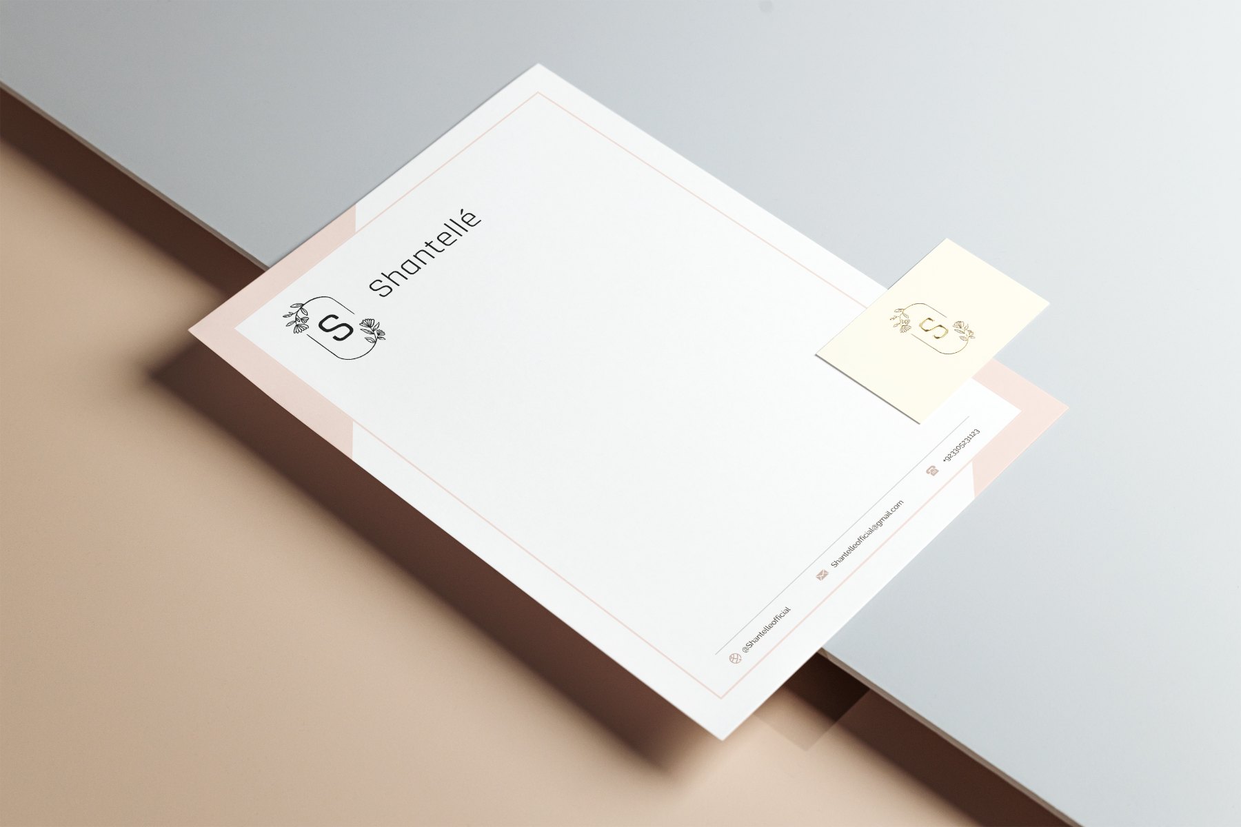
Card, letterhead, and signage were drawn from one set of rules, so the monogram holds at every size, from a blind emboss you notice by touch to a lightbox read from across the street.
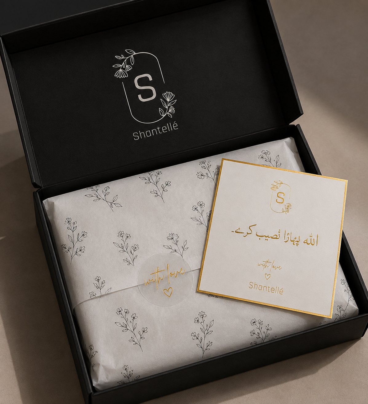
The order arrives already feeling like a gift.
Silver foil on a matte black box, tissue printed from the same floral linework as the monogram, and a gold-bordered note card carrying a blessing in Urdu. Opening the parcel is the last step of the brand story, so it was designed with the same care as the first.
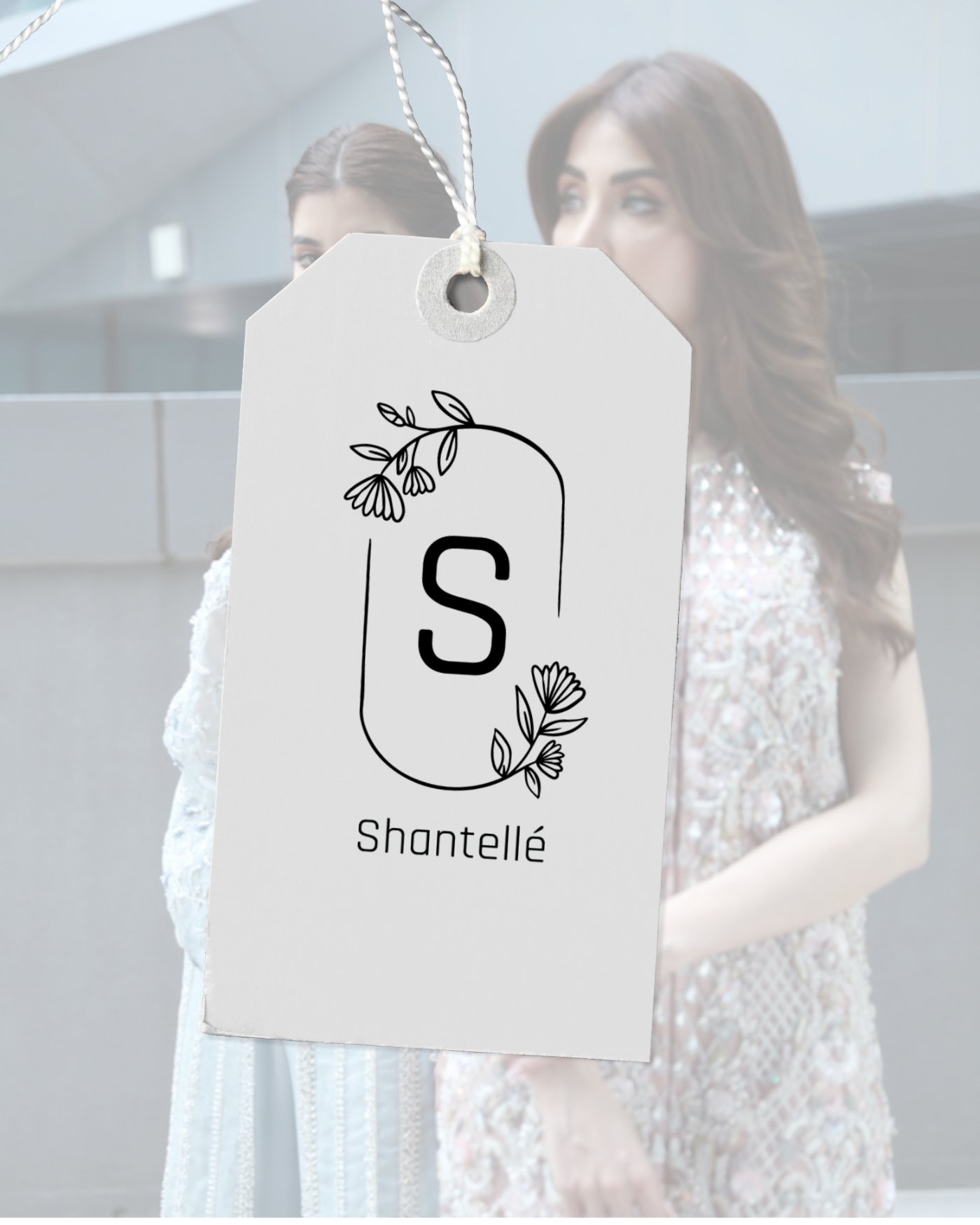
One identity, carried from the label to the last screen of checkout.
Branding, storefront, and content were designed as one system rather than three deliverables, which is what lets a small label read as a premium house online.
The result is a storefront that sells the way the brand speaks, unhurried, visual, and specific, with stronger recall across the channels that bring people to it.
Have something worth building well?
Tell us what you are building. We reply within two working days.
Start a project →