Rocktech
A U.S. software and marketing company selling staff augmentation, custom development, QA, and healthcare marketing from one site. We rebuilt the positioning so an enterprise CTO and a clinic manager each find their own way in.
UI & UX design
Layout · Interface design
Brand refinement
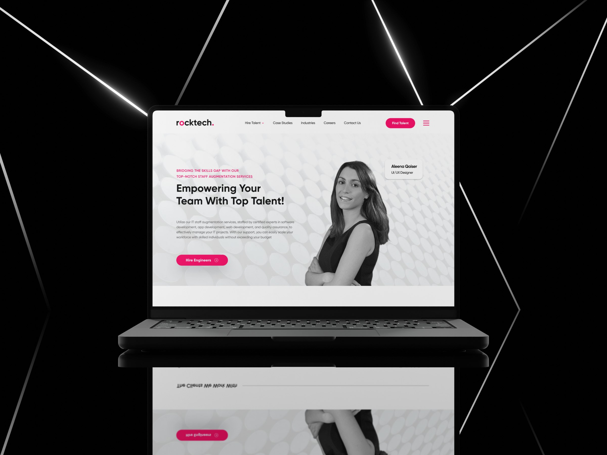
Several very different services, but the site made them feel like one long list.
Staff augmentation, custom software development, QA, and healthcare marketing were all sold from the same pages, to audiences that share very little. We repositioned Rocktech so the site speaks to enterprise tech clients and healthcare partners without either feeling like an afterthought.
Rocktech is also a hybrid team, balancing U.S. credibility with offshore efficiency. The design and content strategy leaned into trust, transparency, and proven capability rather than hiding the model.
Clear navigation for complex offerings.
A clean, modular layout organises IT staffing, QA, and healthcare marketing into digestible, client-friendly sections, each with its own proof: process, products, client wall, and project-ready capability.
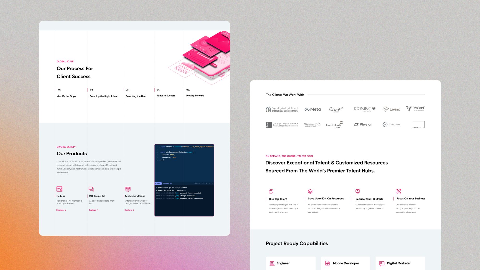
From technical services to creative solutions, all under one UX strategy.
Communicating expertise through design.
The site was built on a strategic blend of content design and visual hierarchy, so even specialist offerings like QA and MedSpa marketing read plainly to a first-time visitor.
The aim was to convey depth without overwhelm: restrained motion, concise messaging, and a grid that holds long service pages together.
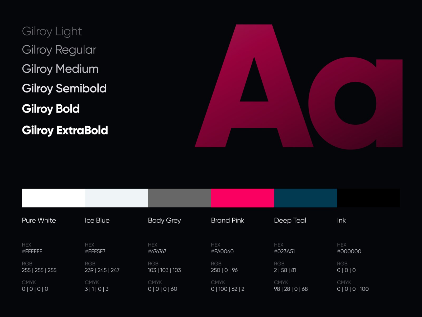
A flexible yet focused design language.
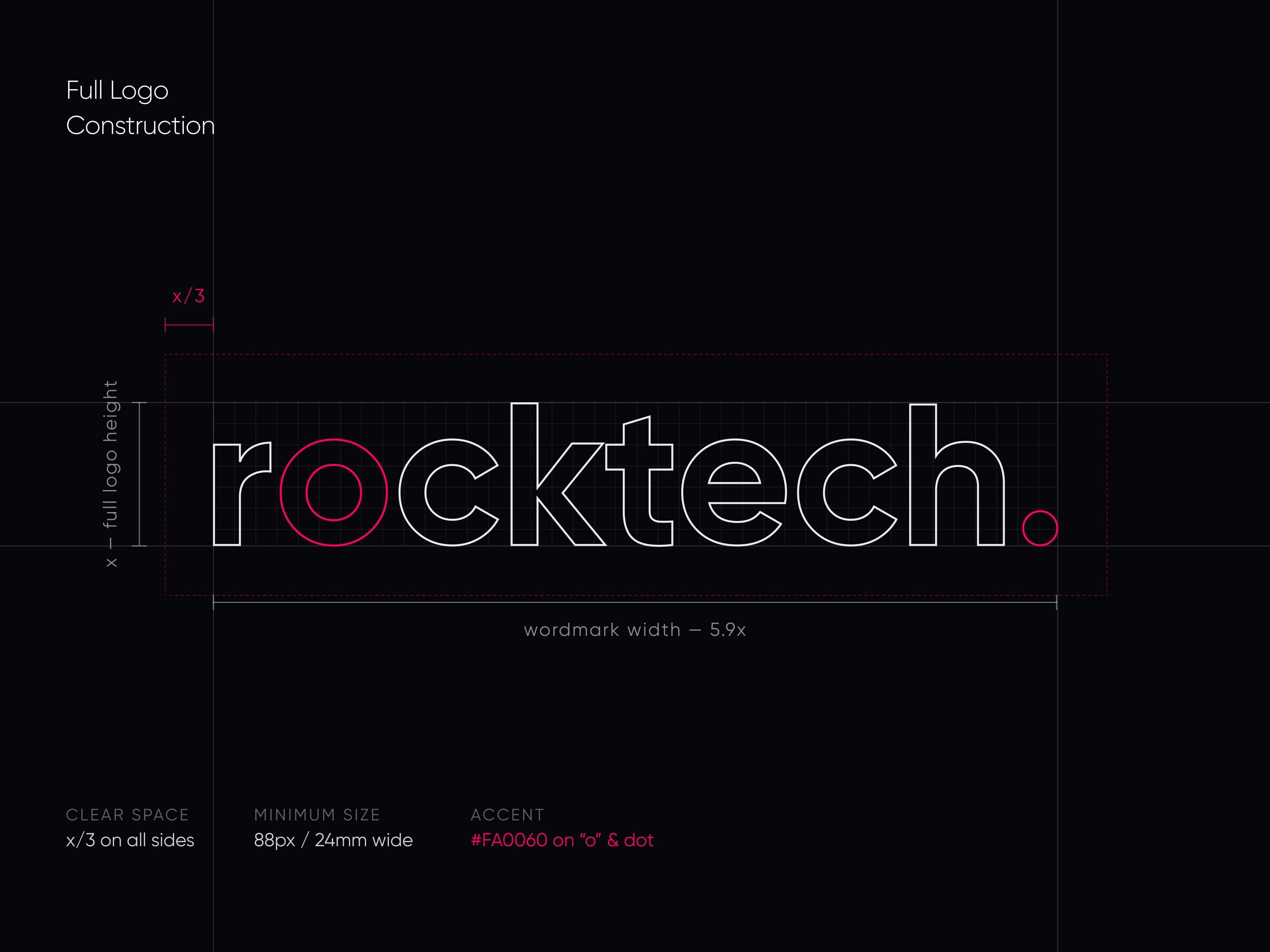
Colour, iconography, and type were refined to signal professionalism and growth, documented so the experience holds from homepage to contact form, and so a new service page can be added without a redesign.


























The same system, down to the browser tab.
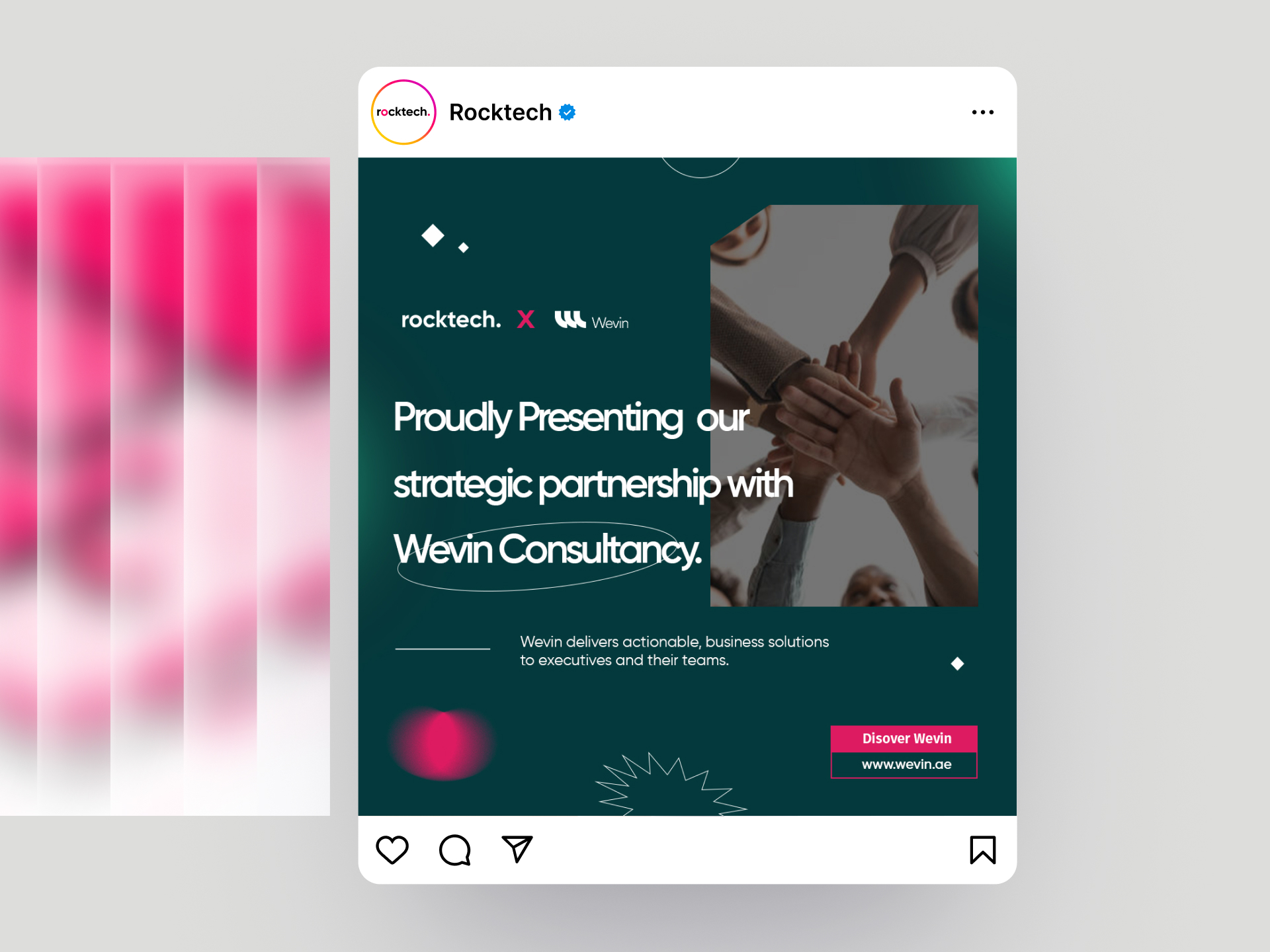
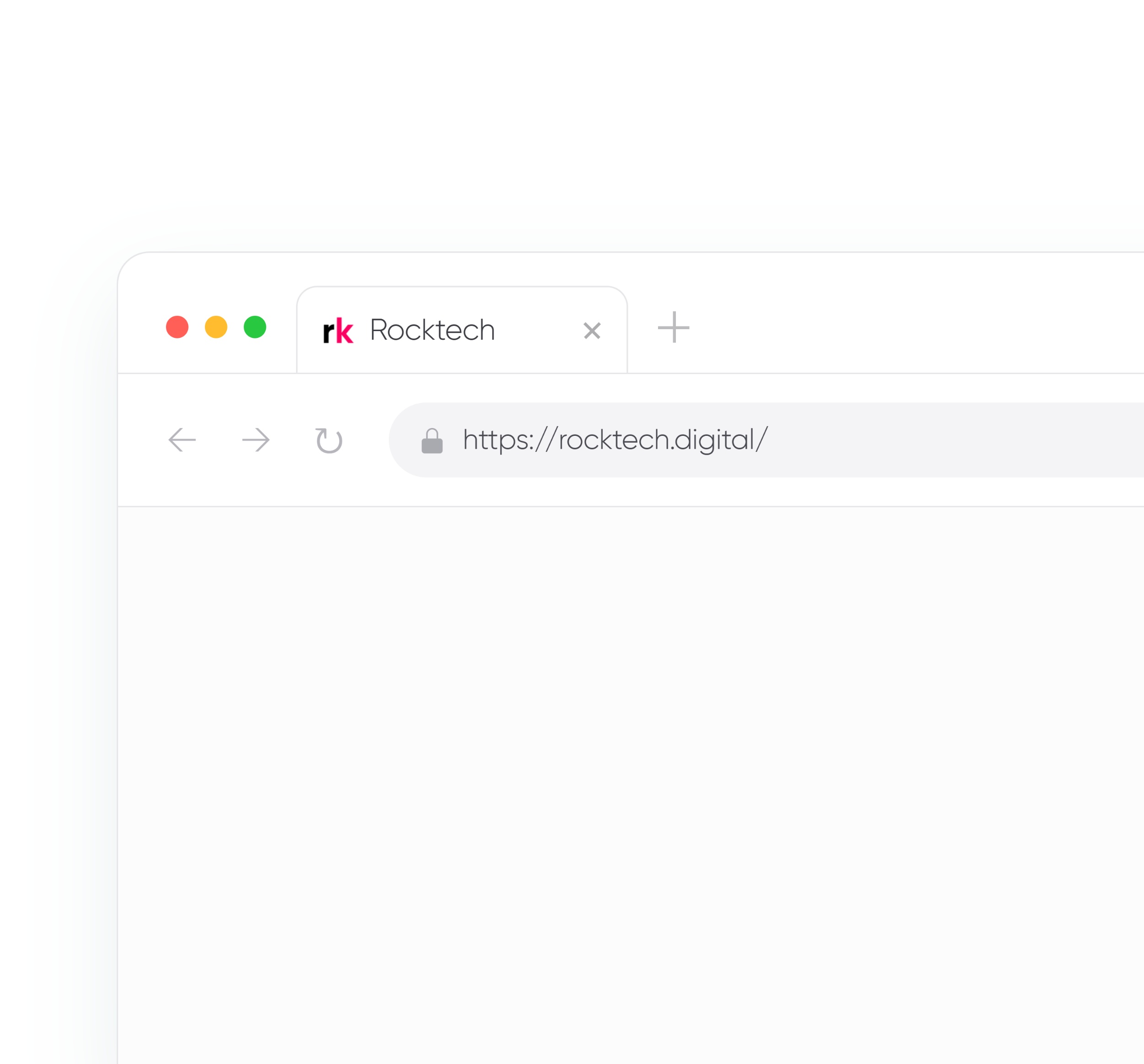
A partnership announcement uses the same grid, type, and accent as the site. The mark holds up at favicon size too, so Rocktech stays recognisable from a feed post down to a browser tab.
One company. Two clear audiences.
The new structure foregrounds the core services, the offshore capability, and the industry focus areas while staying accessible and conversion-driven.
Whether it is read by a CTO or a clinic manager, the site presents Rocktech as credible, capable, and easy to engage with.
Have something worth building well?
Tell us what you are building. We reply within two working days.
Start a project →